Bringing The Beauty Of The Desert Inside
Have you ever looked out at a sunset and thought, "I love the way that looks"? Or seen a picture of the Grand Canyon in the middle of winter and been amazed by the riot of colors? The people that started the southwestern decor style did too. Southwestern decor is absolutely stunning, and there are many people that love it in their homes. This week we are breaking down just what it is that makes the design work.
What defines it?
Southwestern style is a hodgepodge of different influences that have melded to create an incredibly popular style. It blends together Indigenous, Spanish, Mediterranean, and 'American West influences into a unique and homey design.
Southwestern style seems to have originated in the 1920s in Southern California, mixing together the Hopi, Pueblo, and Navajo history, and textile crafts, with the utilitarian Spanish building methods and the more rustic charm of the American West. It also draws inspiration from Mediterranean architecture and pairs it with the flat-roofed homes of the Hopi and Pueblo tribes.
All of the influences that make up Southwestern decor come together in the color palettes often used. In Southwestern decor, the desert isn't just a place that's deadly; it is also beautiful. The earthy tones of sandstones and terra cotta mix with bright blue skies, dusty purples, and cactus greens. None of the colors are chosen at random and instead are carefully selected and balanced one against the other.
How to pull it off in your home
Start With Your Color Palette

Courtesy of Sherwin Williams
While there are many, many beautiful and stunning colors in the desert, you need to build from neutrals like sand, oak, pale yellows, and windswept woods. Then from there, you can bring in the terracotta reds and shades of blue and purple, and gold from the sunsets. We suggest starting with neutral colors that you'll use throughout your home and then allowing different colors to pop out at different points. Say, bringing in lots of vibrant reds in one room or purples and golds and another. But the whole of it is balanced by the neutral undertones.
Tiles Are For More Than Backsplash

Tiles are a common staple in southwestern homes and decor styles that emulate them because they are great at cutting down on your cooling bills. Tiles will stay cool during hot summer days, but they retain heat on those equally cold nights. Terracotta tiles are not only fantastic for decorating, for backsplashes, or for the odd nook or cranny in your home, but also for just this purpose. You can also bring in turquoise blue tiles in strategic areas to add a lovely pop of color and add a visual surprise to a room.
Go Bold With Geometric Patterns
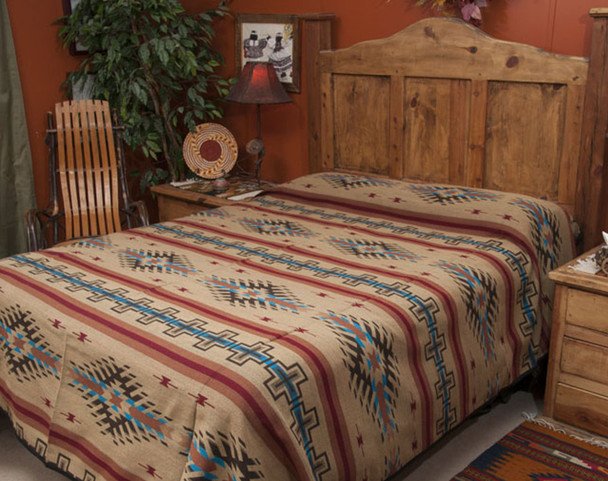
Courtesy of Mission Del Rey
If you talk about the Southwest, many people will bring up Navajo-created or inspired textiles. You can also bring in other similar but different patterns that work based on geometric designs, as many of the Navajo patterns do. If you're not comfortable with using them for a couch or a chair, you could use them for a throw or a table runner.
Find the Soft Spots
Although the word 'deadly' might be what comes to mind for most of us when thinking about deserts, there are hidden gems. Think about the gentle arcs of a windswept canyon or the soft clouds that stretch across the sky. Think of pocket springs and saguaro cacti. All of these can add a sense of calm within the desert, and you can mimic that within your own home.
Act Natural
Much of the furniture within the Southwestern style is different from the fast furniture of today. The style is not clean or sleek. Think big plank tables, oversized chests, and intricately carved pieces spread throughout the house. Or chair backs and side tables and cabinets. There are little gems of detail everywhere. Pine was an easily sourced material, and so it's very commonly seen. The paleness of it also works very well with the neutral base of Southwestern style. Pine also pairs beautifully with woven fabrics and leather.
Bring In The Green

Courtesy of Moins-Despenser
No matter where we live, most humans love plants. In a southwestern home, that might mean cacti. They come in so many different shapes and sizes, everything from the giant saguaros to tiny bunny-eared cacti. You can decorate with all sorts of cacti inside and outside of your home, and since they are very hardy plants, they cut down on your water bill too.
Details Mean Everything

Courtesy of Mission Del Rey
We talked about the major facts; let's look at the details. Wrought iron, pottery, and woven baskets. Not only are all of these very much a staple within the Southwestern design, but they're also utilitarian. Wrought iron is stable and weather resistant, so you can use it inside and outside while still being utterly beautiful. Pottery serves so many different purposes within a home, so it's only limited by what you can dream up. Woven baskets are much the same; you can use them for everything from laundry storage to wall decor to grab-and-go kids baskets. Whatever you go with, don't be afraid to get creative with it. Use something in a way that's unexpected. Look to other aspects of the desert that you might not see popularly used. These are the elements that are going to make your house uniquely yours.
As always, we hope that you enjoyed our take on this aspect of home decor. Will you take on a southwestern design at some point? Let us know why or why not over on our Facebook page.
If it is not your love of decor but instead your hatred of your malfunctioning refrigerator that has brought you to us today, you're still in the right place. At Appliance Rescue Service, we take care of all major appliances and work with you to get your home running smoothly again. When you reach out to us via our contact page or by giving us a call at ((214) 599-0055), we'll work with you to set up a time and date that works with your schedule to send out one of our experienced technicians. Whether you live in Dallas, McKinney, or Frisco, we want to help.