
A Showstopping Color That Gives Rise to Bold Expression and Comfort Simultaneously
It's that time of year, when everyone is excited about the new Color of the Year from Pantone. Pantone influences many different fields including beauty, marketing, and most importantly to us, home decor and design.
Before we show off the new color though, how does Pantone choose the color? Just how did they decide? According to Laurie Pressman, the Vice President of Pantone Color Institute, "To arrive at the selection each year, this global team of color experts at the Pantone Color Institute comb the world looking for new color influences. This can include the entertainment industry and films in production, traveling art collections and new artists, fashion, all areas of design, aspirational travel destinations, new lifestyles, playstyles or enjoyable escapes as well as socio-economic conditions. Influences may also stem from new technologies, materials, textures and effects that impact color, relevant social media platforms and even upcoming sporting events that capture worldwide attention." Pantone created a color language that everyone across many different industries can use to ensure that everyone knows exactly what color they're talking about, and more importantly how to replicate it. They also do research across many different cultures to find how and why colors affect us the way they do. All of this together means that they are very good at choosing colors.
What Is The Color?
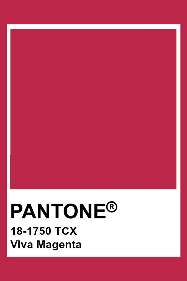
Credit: Pantone
All of that said, this year's color is a showstopper. This year's color is Viva Magenta! (18-1750) A vibrant and stunning red that according to Pantone "encourages experimentation and self-expression without restraint." It is a balanced tone between warm and cool colors. Viva Magenta is a modern color for the Post-Pandemic world but one that is deeply rooted in the past.
What Does It Draw Inspiration From?
Viva Magenta is a riff on carmine red. This is one of the most expensive and valued dyes of the natural world. It comes from cochineal insects, and their shells. Hundreds of thousands of these beetles would be collected and ground up in order to create the color, for dyes and paints. Carmine was once a major export from the Americas, and is again a rising economy in that portion of the world.
What Colors Does It Pair Well With?
Apartment Therapy (one of our favorite places to look for trends) put together four different palettes that they feel Viva Magenta would work well with. The first, called Resonance, is a sumptuous selection of colors that give a very rich and elegant feel to a room. Looking at them, they make us think of soft velvets, a warm fire, and a glass of wine. The second, titled Ignite, is all soft hues that Viva Magenta splashes into the middle of. If you're usually one for calmer, more relaxed environs, this might be the palette for you. The third palette is one aptly named, Family Ties. This is a palette built around the shades both brighter and darker than Viva Magenta, pinks, reds, maroons, and a soft red-grey color that we didn't think we could like and have been surprised. This one brings to mind the dining room and kitchen, with warm tones that evoke friendship, family, and community. The final palette is one titled Equilibrium, and while the other palettes have had Viva Magenta as the star, this one balances the color with others of equal vibrancy. This one is all about rich hues in very tropical tones with two softer colors to keep it from exploding into a riot.
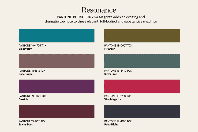
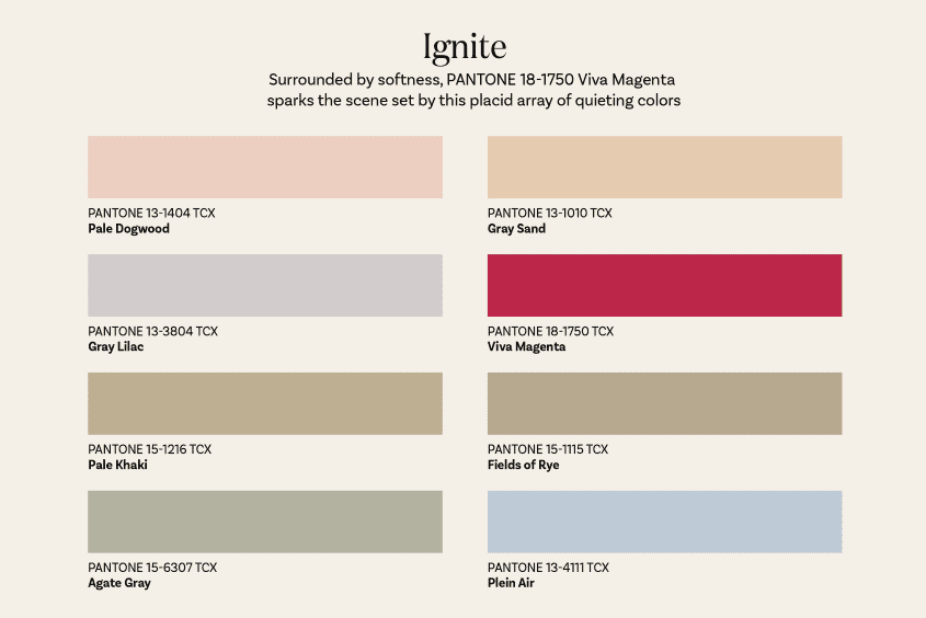
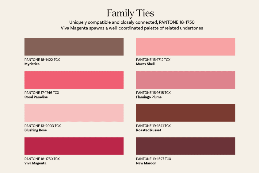
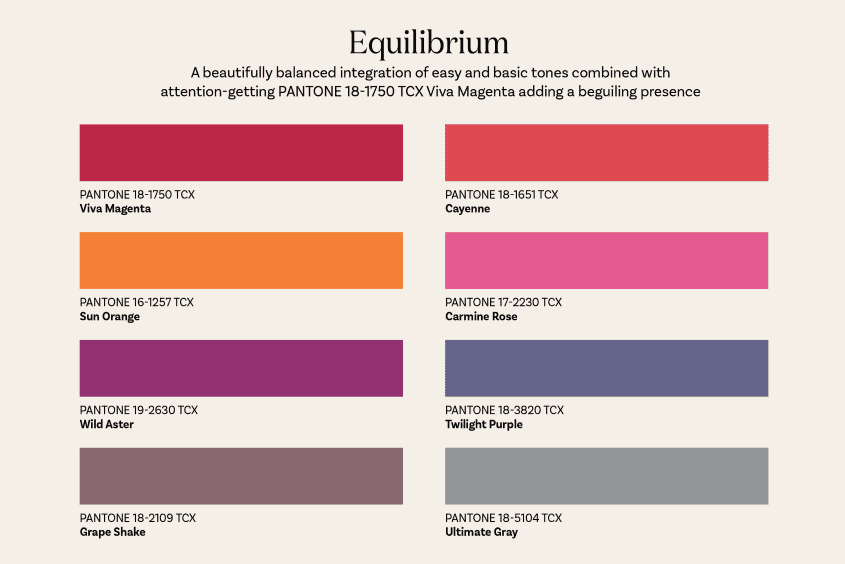
(Credit: Apartment Therapy)
All four of these palettes are only the beginning of what we expect to see over the next year, or more, as people play and experiment with this color. If you've already got ideas, why not show it off on our Facebook?
Places It Might Look Good Around The Home
We think that Viva Magenta can be great just about anywhere, depending on how you balance it. If you've got a room that needs a bit more pop to it, throw in a few blankets and pieces of decor. If you're looking for something louder, try painting a wall or painting the trim in it. We could also see this as a way to paint your ceiling if you're not wanting to change up the walls but still want to add some heat to a room. There are SO many different ways that this beautiful red could fit into the home that we aren't really seeing a place where it wouldn't fit.
An interesting side note for those of you who enjoy speculation on colors. Originally many suspected that the color Digital Lavender was going to be this year's color. While many experts, including MSN & Architecture Digest both, reported early on this was the color, it ended up not being the case. We will say that the calmer grey-hued lavender is a very nice color, but we find that Viva Magenta is very fitting for this year and the hopes that many are bringing into the year.
What about you? What are your thoughts on Pantone's color of the year? Will you be bringing it into your decorating? Your furniture?What about your appliances? Let us know in the comments below or over on our Facebook page.
If, on the other hand, you're more worried about the health of your appliances rather than what color they are, we can still help with that. Reach out to us on our contact page or by giving us a call at ((214) 599-0055). We'll work with you to find a time and date that work for your schedule and send one of our experts out on the day you choose. At Appliance Rescue Service, our goal is to get your home running smoothly again.