Discover how thoughtful flooring and ceiling choices can add character, warmth, and lasting style without overwhelming your home's design.
When most of us think about decorating a room, we start with the walls. That's where the paint goes, where the artwork hangs, and where family photos tell our story.
Courtesy of Andrea Davis
But designers have increasingly turned their attention somewhere unexpected: beneath our feet and above our heads.
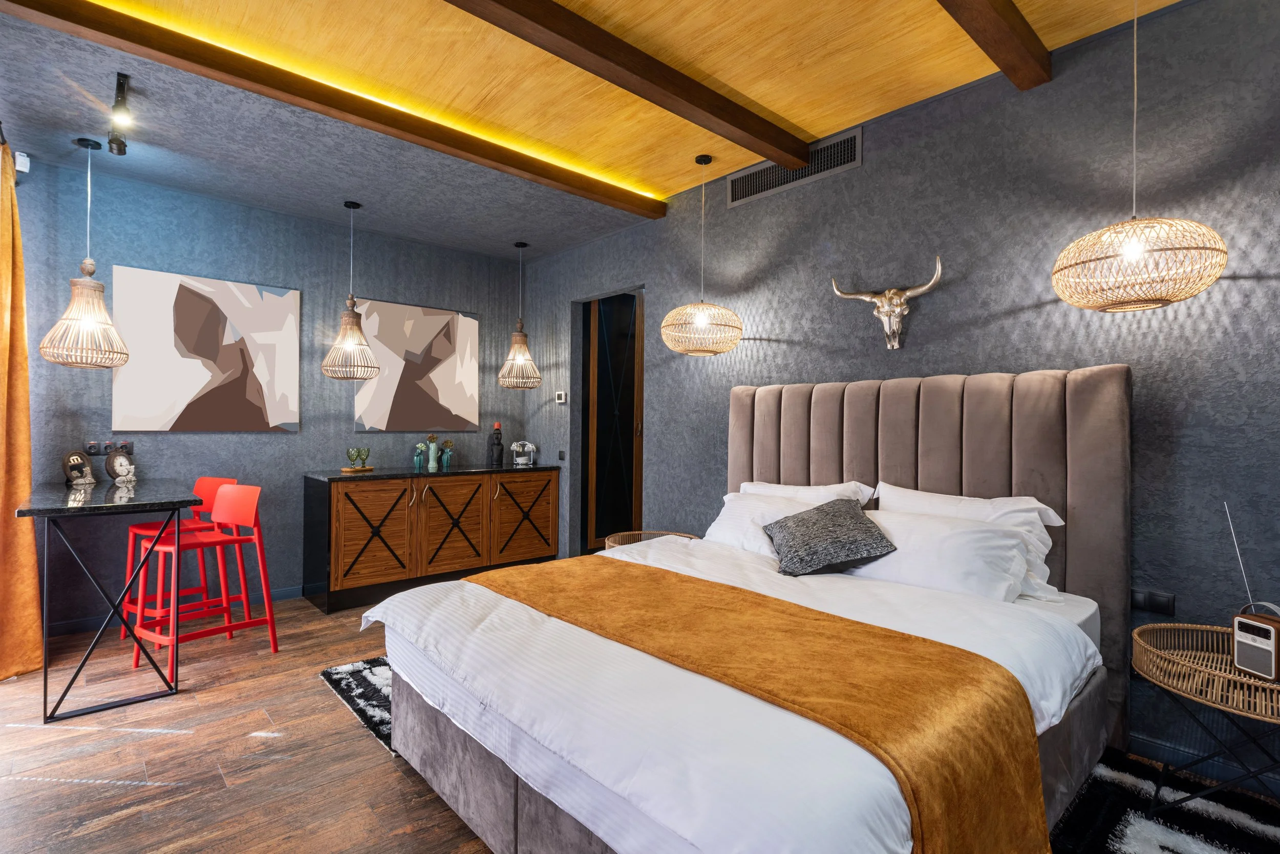
Floors and ceilings are increasingly being called the "fifth wall," as designers encourage homeowners to think beyond paint colors and furniture. Instead of treating these surfaces as purely functional, many are embracing patterned hardwood, decorative ceiling beams, wallpapered ceilings, bold paint colors, and architectural molding to give rooms more personality.
The appeal isn't simply about following the latest trend. It's about creating a home that feels thoughtfully designed and uniquely yours.
Looking Beyond the Four Walls
Most homeowners want their homes to feel inviting and memorable. At the same time, few people want to invest in a design choice that feels overwhelming or quickly falls out of style.
Courtesy of Max Vakhtbovych
That's one reason the "fifth wall" movement has gained traction. Instead of filling every room with bold colors and dramatic décor, it encourages homeowners to focus on two of the largest surfaces in the room that often receive the least attention.
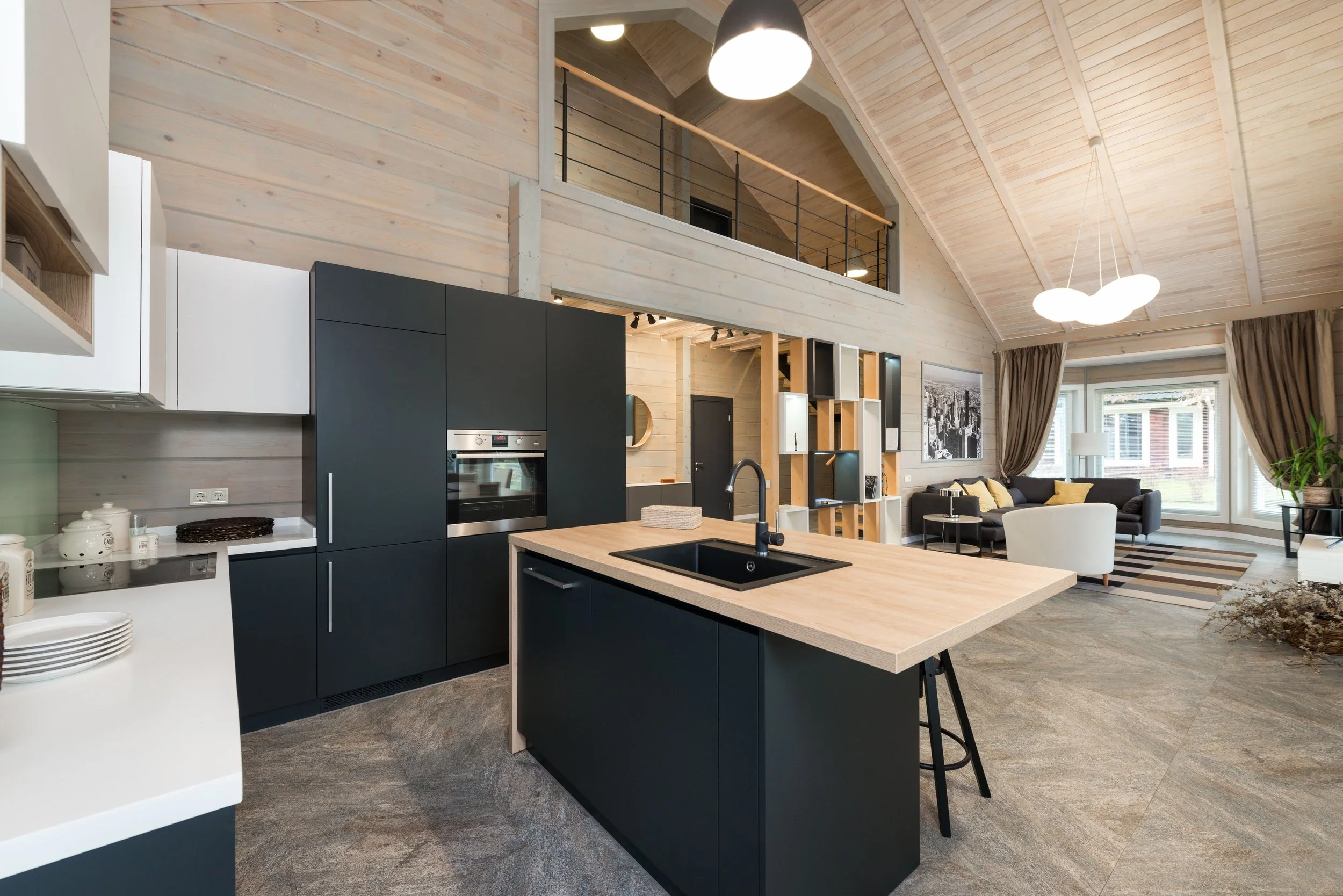
A herringbone hardwood floor can introduce movement without changing the room's color palette. Decorative ceiling beams add warmth, while tray ceilings, wallpaper, or bold paint can turn an overlooked surface into the room's focal point. Rather than competing with every other design element, these features create interest in places homeowners often ignore.
It's less about making a loud statement and more about making an intentional one.
Statement Floors: Building Character from the Ground Up
Flooring has always been expected to work hard. It needs to stand up to daily life, pets, guests, and everything else a busy household throws at it.
But today's designers are also asking it to do something else: tell part of the home's story.
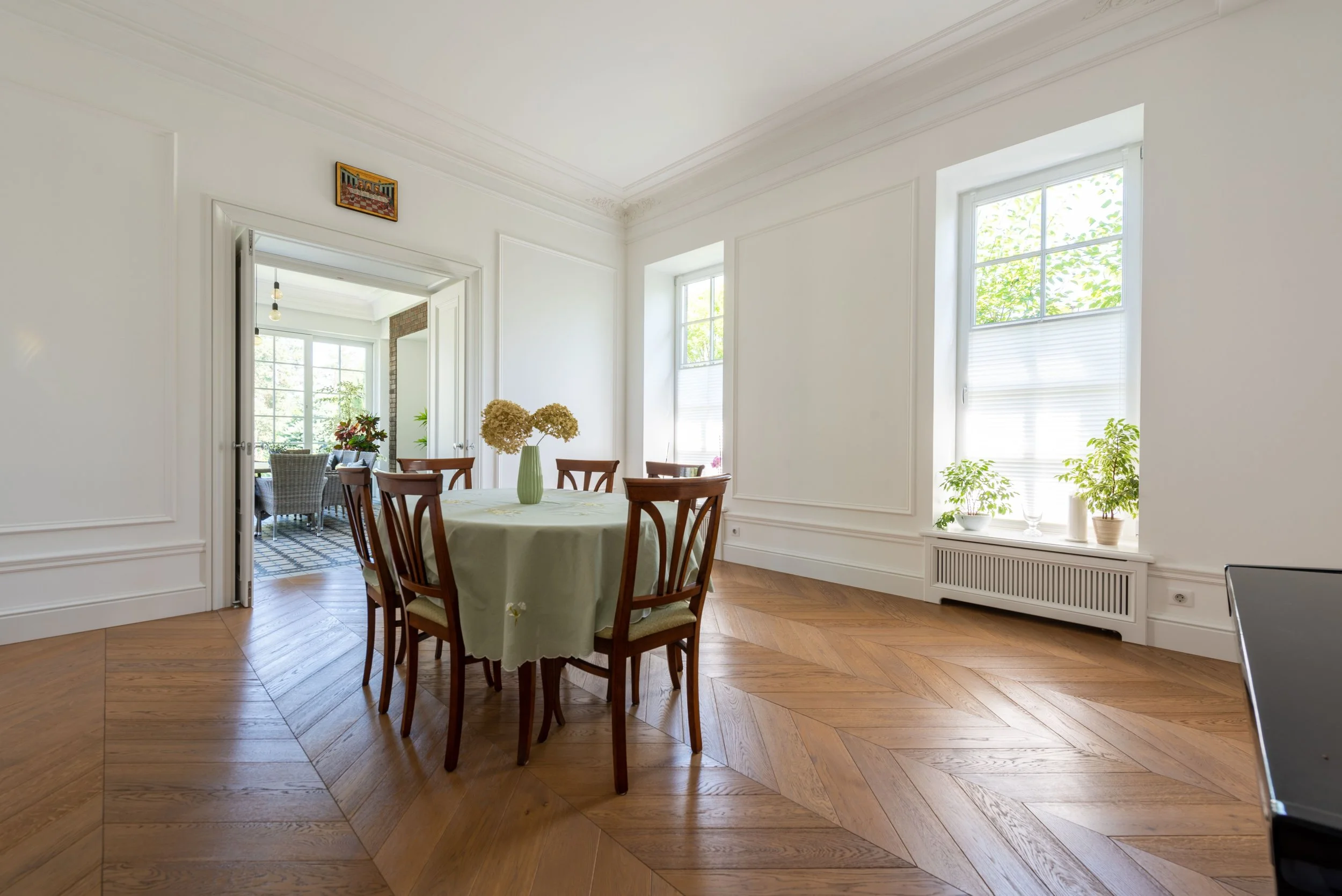
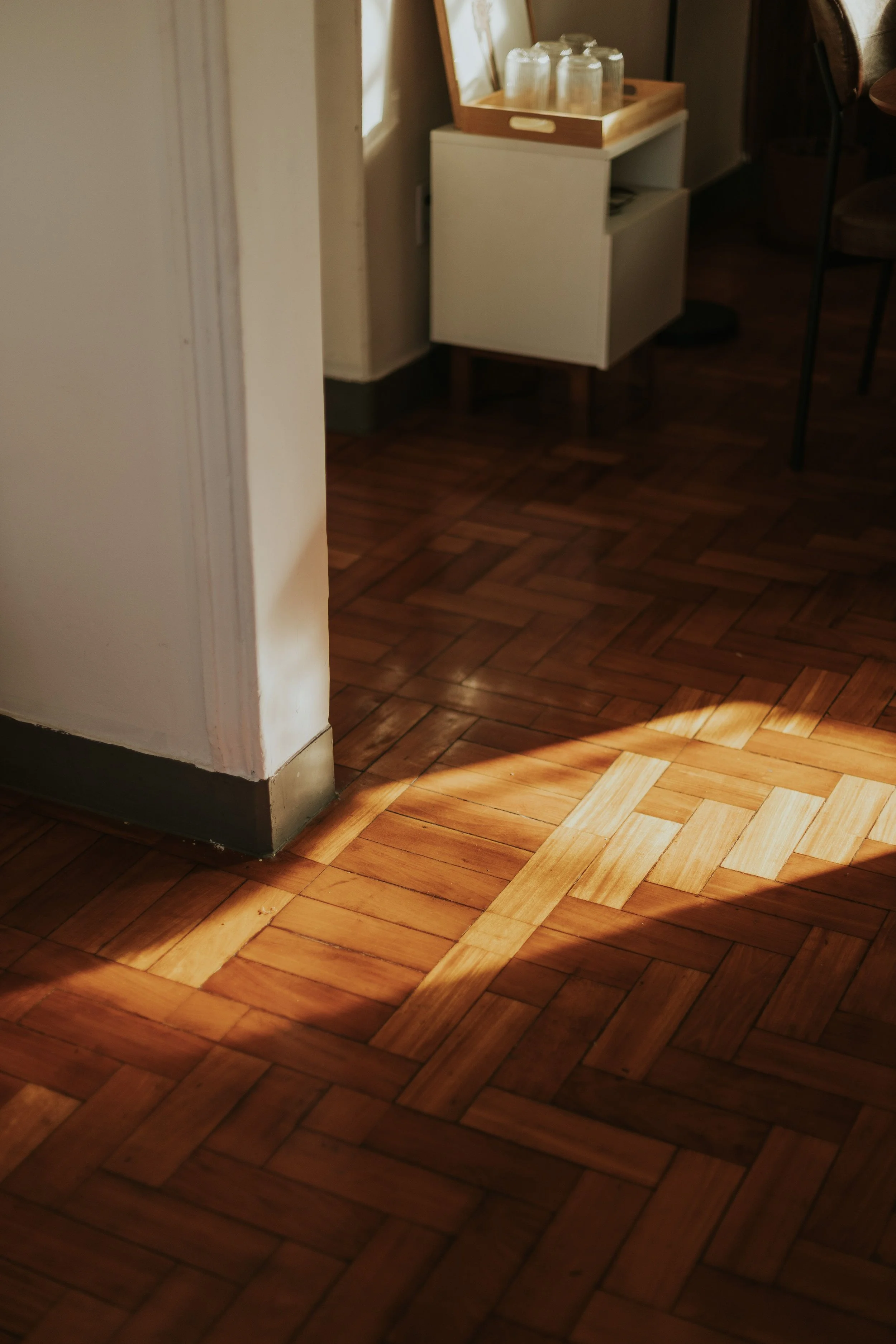
Patterned hardwood floors, particularly herringbone and parquet, have appeared again and again in recent design inspiration. Rather than changing the material itself, these layouts use familiar hardwood in unexpected ways to create visual interest.
While herringbone and parquet remain popular choices, designers are also showcasing checkerboard tile, geometric mosaics, decorative border inlays, cork flooring, and patterned luxury vinyl. Each offers a different look, but they share the same goal: giving the floor a more active role in the room's overall design instead of simply blending into the background.
Although these styles look very different from one another, they all ask homeowners to see the floor as more than something to walk on. It becomes part of the room's design story.
The most successful statement floors often rely on timeless materials while letting the pattern become the feature. That approach helps create rooms that feel fresh today while remaining comfortable to live with for years to come.


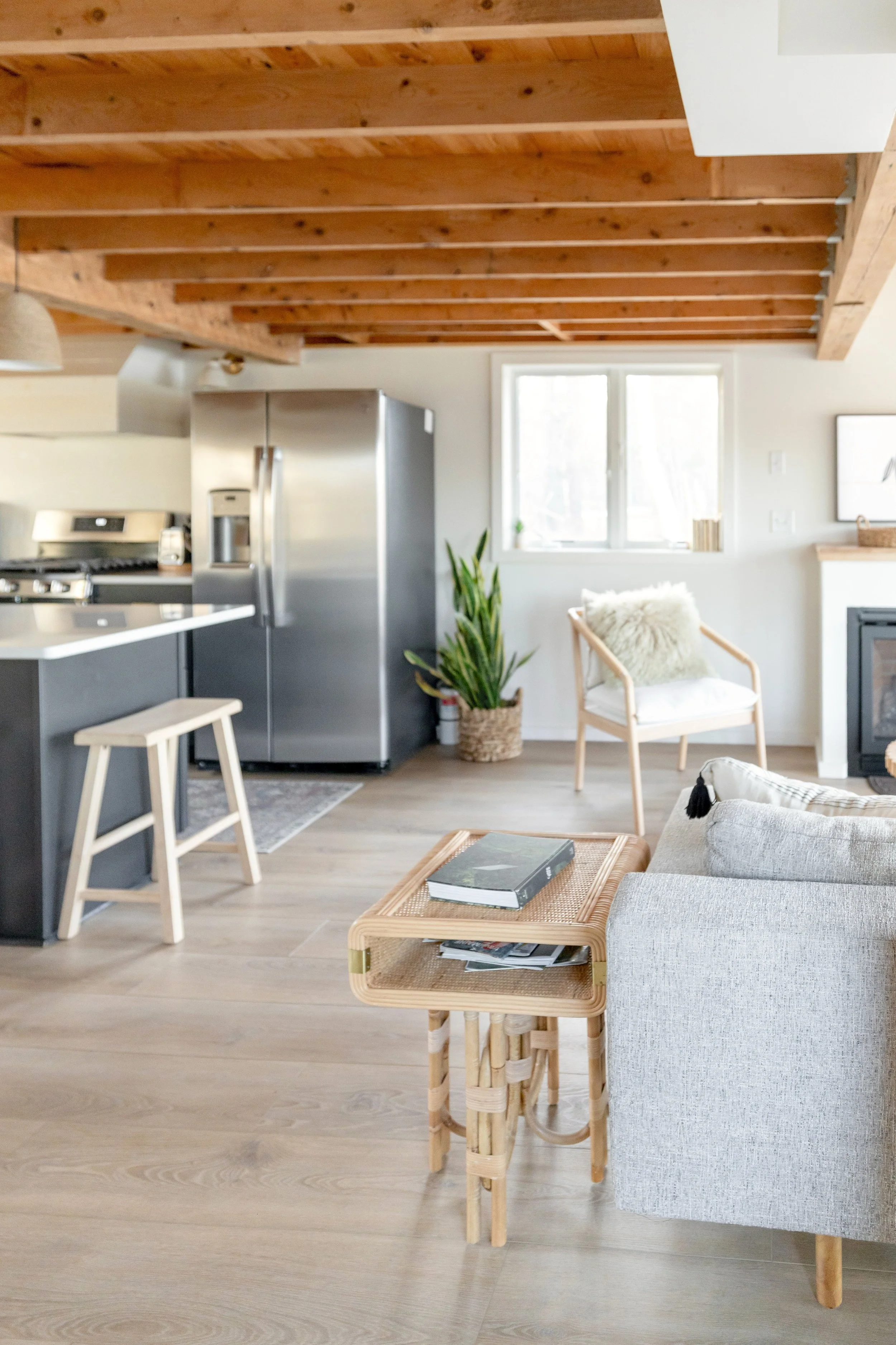
Don't Forget to Look Up
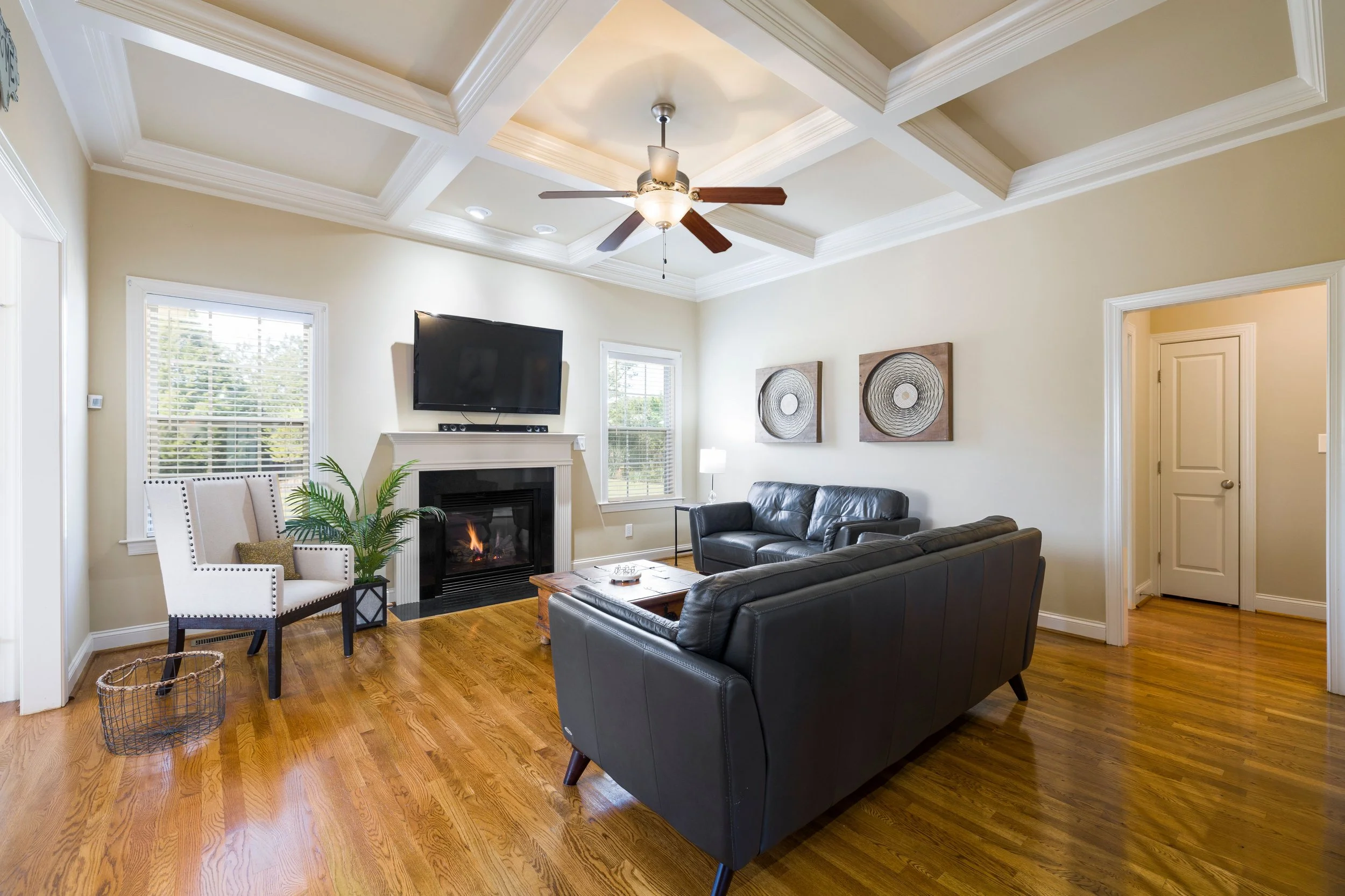
If floors have become one half of the "fifth wall" movement, ceilings have become the other.
For decades, ceilings were almost expected to disappear into the background, painted white and rarely noticed unless they needed repair.
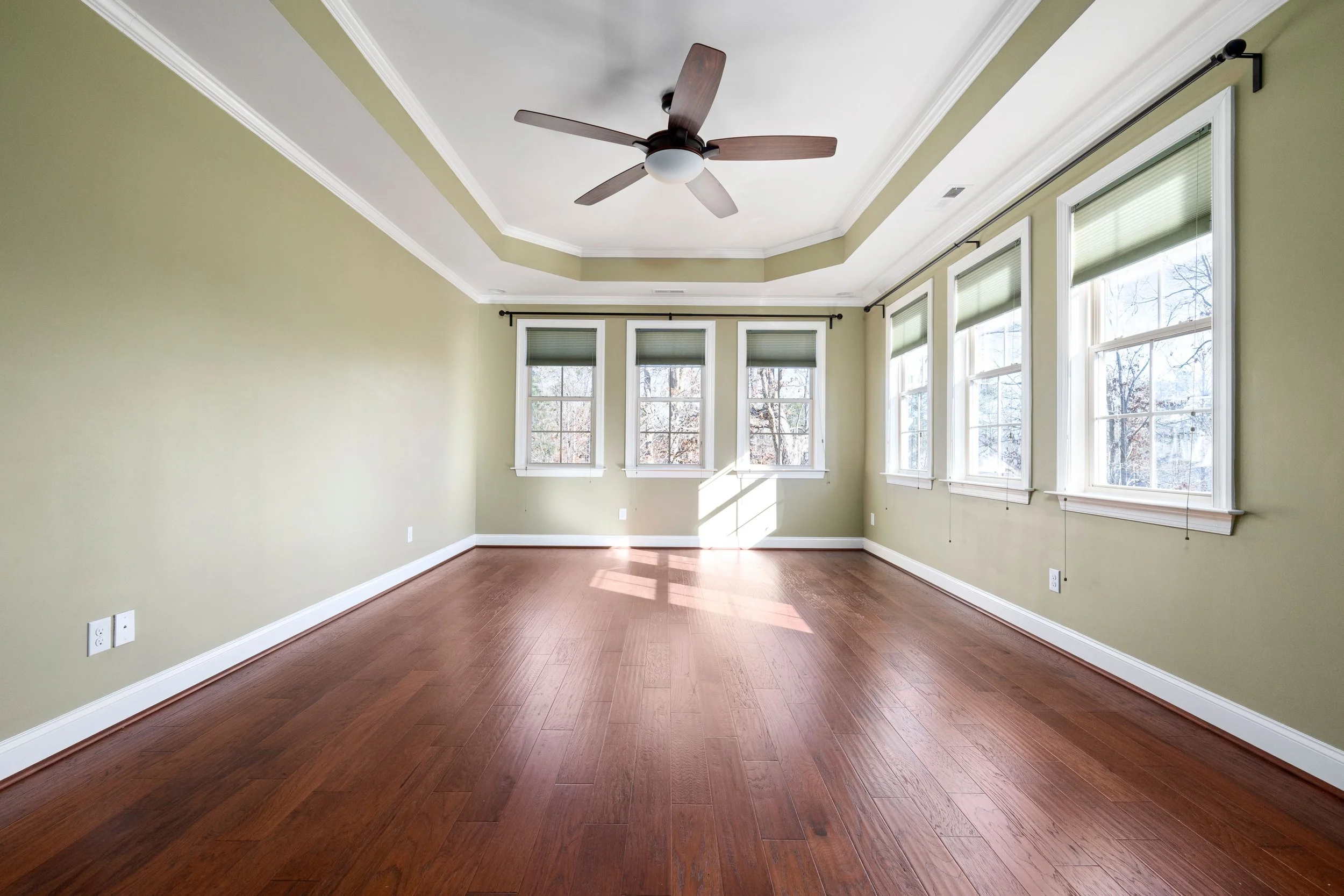
Today's statement ceilings come in many forms. Homeowners are installing exposed wood beams or coffered ceilings to add architectural character. Others are choosing tray ceilings with indirect lighting, applying wallpaper overhead, or painting the ceiling in rich colors that make a room feel cozier or more dramatic. Even simple crown molding or wood paneling can help transform a ceiling from an afterthought into a design feature.
Even subtle changes can have a surprising effect. A ceiling treatment naturally draws the eye upward, changing how a room feels without changing its footprint.
It's a reminder that great design isn't always about adding more. Sometimes it's about looking at familiar spaces in a new way.

Bold Doesn't Have to Mean Busy
One lesson appears throughout this growing design movement: the most memorable rooms aren't necessarily the ones with the most decoration.
A dramatic floor often works best alongside simple furnishings. For example, a striking herringbone floor may become the room's centerpiece when paired with neutral furniture and understated décor. Likewise, a wallpapered ceiling or exposed beams can make an impact without requiring every wall to compete for attention.
A patterned ceiling can become the room's focal point when the surrounding walls remain understated.
By allowing one element to take the spotlight, the rest of the room has space to breathe.
That balance is what gives many of these homes their sense of comfort. They feel curated rather than crowded, distinctive without becoming distracting.
For homeowners, that's an encouraging takeaway. Creating a memorable home doesn't require redesigning every surface. Sometimes one thoughtful choice is enough to transform the entire room.
Designing a Home You'll Love for Years
Trends naturally come and go, but the best design decisions are the ones that continue bringing joy long after the excitement of a renovation has faded.
Whether you're drawn to a timeless herringbone floor, decorative ceiling beams, a bold painted ceiling, or simply appreciate the creativity behind the "fifth wall" movement, the goal isn't to copy someone else's home.
It's to create spaces that feel welcoming, comfortable, and reflective of the people who live there.
When every design decision supports the way you want to live, your home becomes more than a collection of rooms. It becomes a place you genuinely enjoy spending time in, today and for years to come.
Keeping Every Part of Your Home Working Beautifully
Thoughtful homeownership extends beyond great design. The homes people enjoy most are the ones that are both beautiful and well cared for.
At Appliance Rescue Service, we're passionate about helping homeowners make informed decisions about every aspect of homeownership. While we specialize in keeping your major appliances running reliably, we also believe that a well-maintained home is one you'll enjoy for years to come.
If your refrigerator, dishwasher, oven, washer, dryer, or other major appliance needs expert attention, Appliance Rescue Service is here to help homeowners throughout Dallas, Frisco, Plano, Richardson, Garland, McKinney, Allen, The Colony, Addison, Carrollton, Coppell, and the surrounding communities. Contact us today to schedule a repair or ask about our maintenance plans, and keep the heart of your home running as beautifully as the spaces you've created.
Website
Call: (214) 599-0055