Design

Modern Victorian: How To Achieve the Look In Your Home

Bringing the Historical To Your Home

Did you ever dream of the Victorian period's lavish balls and parlor rooms? Or watch a show or movie set in the time and wish you could decorate your home the same way? Well, you absolutely can. 


The Victorian period stretched from 1837 to 1901 roughly. You saw a certain style within the homes of the well-to-do, the aristocracy, and the nobles. It was easy to identify by an exuberance of ornamentation influences from throughout history and handicrafts. It was also often compartmentalized, breaking rooms into smaller pieces and rather dark, given the shape and space allowed for homes in England. Although the Victorian period has ended, our love of it hasn't. Victorian style has been mixed, remixed, and adapted in various ways, which is why it's still so popular.


Remember that you can still pull off a Victorian style even if you don't have a large Victorian manner or an old home. All you need is a few of these tips.


Highlight Good Bones, Don't Hide Them 


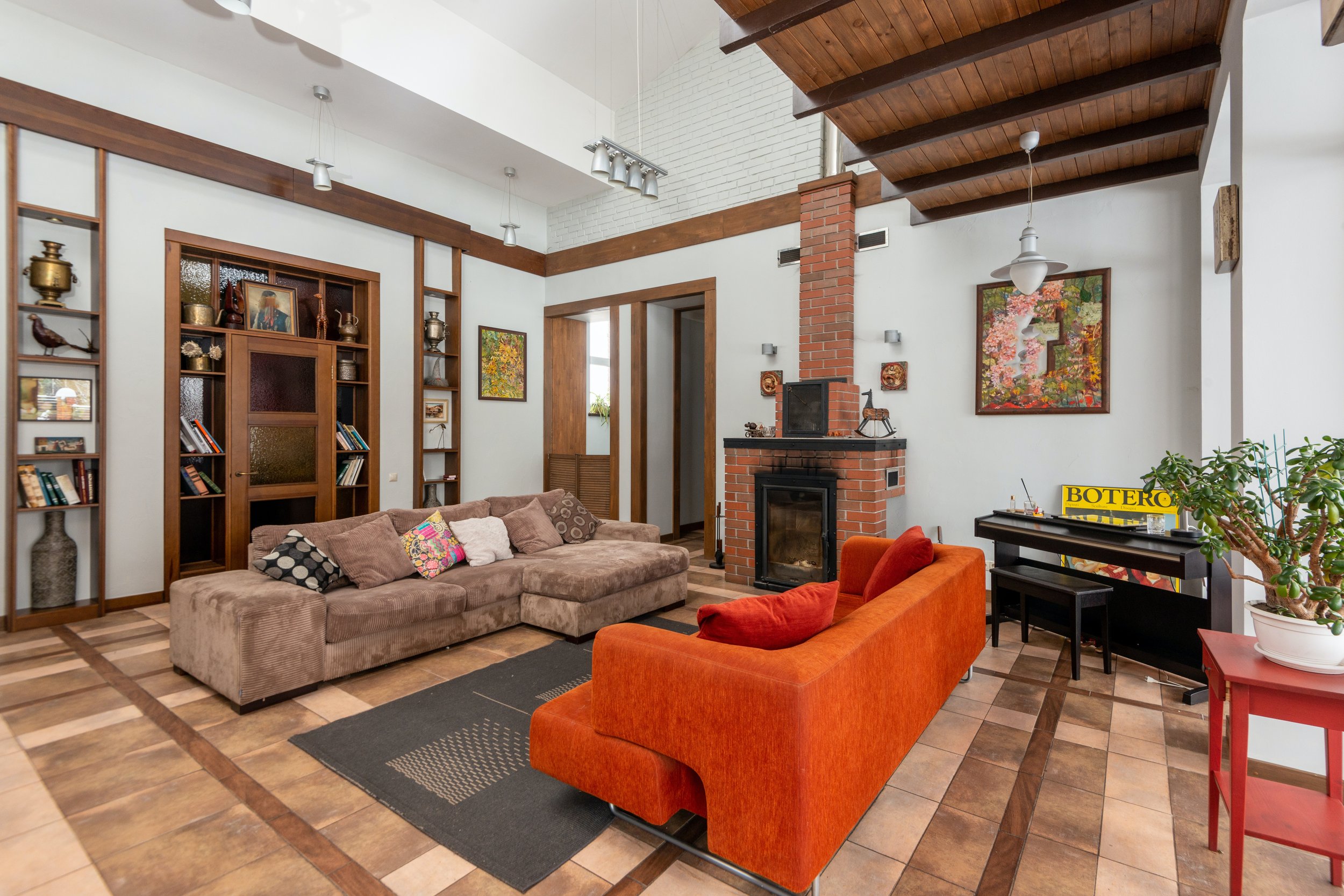
 Rather than hiding the bones of your home, bring attention to them. Do you have wood flooring, any marble, or dark framework? Great! And if you don't naturally have this, there's a decent way you can imitate it. You can also refurbish and draw attention to old brickwork fireplaces, radiators, and mantles.


Pair Ornamentation With Simplicity 

Victorian homes were packed to the brim with detail, which can be very overwhelming to modern comfort. Instead, try allowing room for each. Put a heavily detailed piece in the middle of an open wall.


Imitate The Look Of Bay Windows 


 Even if your home doesn't come naturally with bay windows, you can still have the look of these beautiful Victorian features. You can use a pair of double-door Shutters to frame an entryway, such as a solarium or orangery.


Yes, Your Lighting Does Matter 

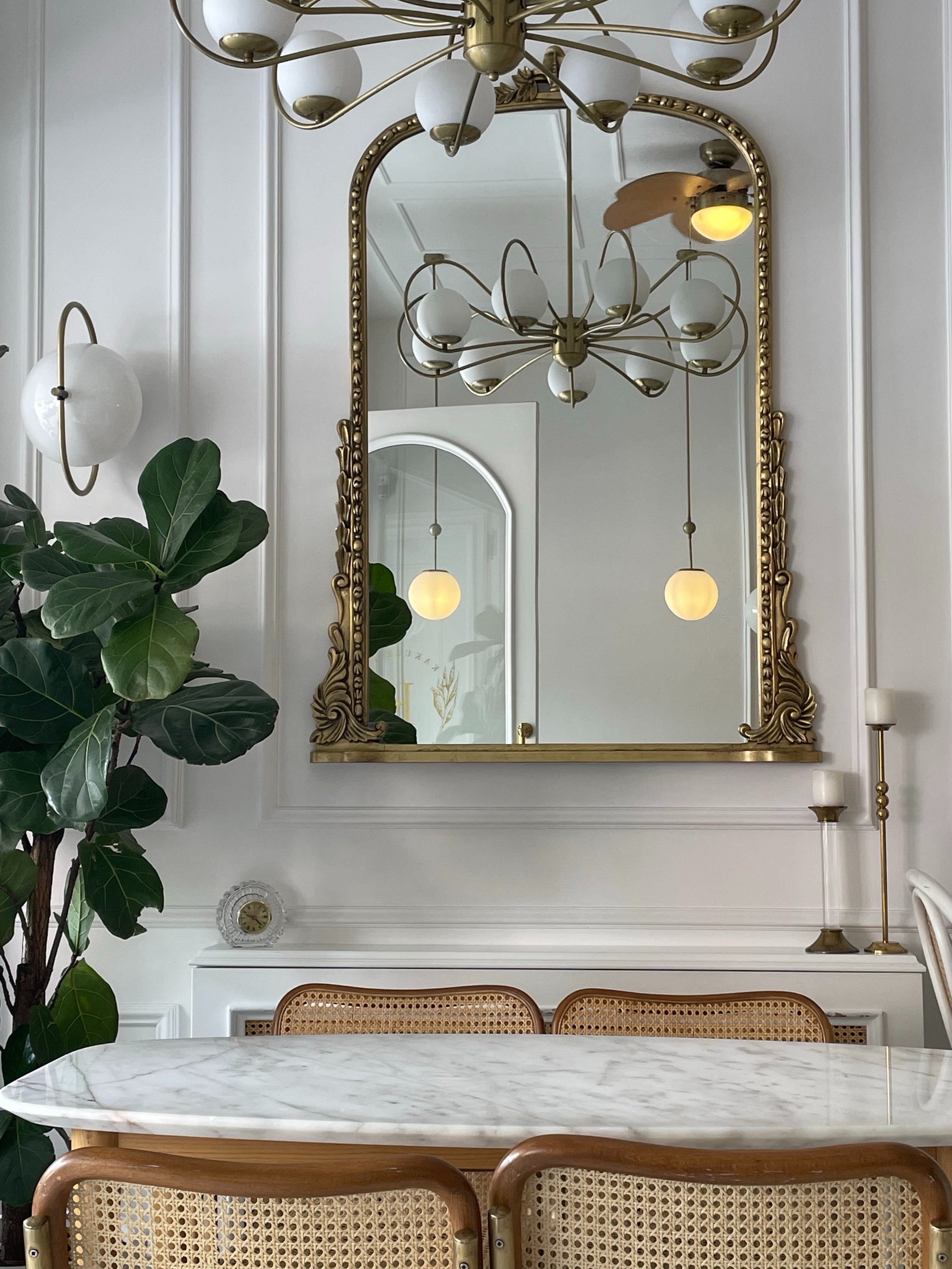
As we said up top Victorian homes were often dark. This came from the time of the industrial revolution, at least if they were in London. The fog at the time was so thick that lamps would be lit by mid-afternoon. Add to that that most lamps were not electric yet but were instead still powered by gas. So lighting was either what little natural lighting you could get through your windows or provided by lamplight and candles. For the modern reader, though, you want something else. Instead, when choosing your lighting, think of each piece as part of the whole room. They can all be bold, sumptuous, and intricate but they should also work together. Choose pieces that mimic one another, even if it is in subtle ways.


Juxtapose Scales


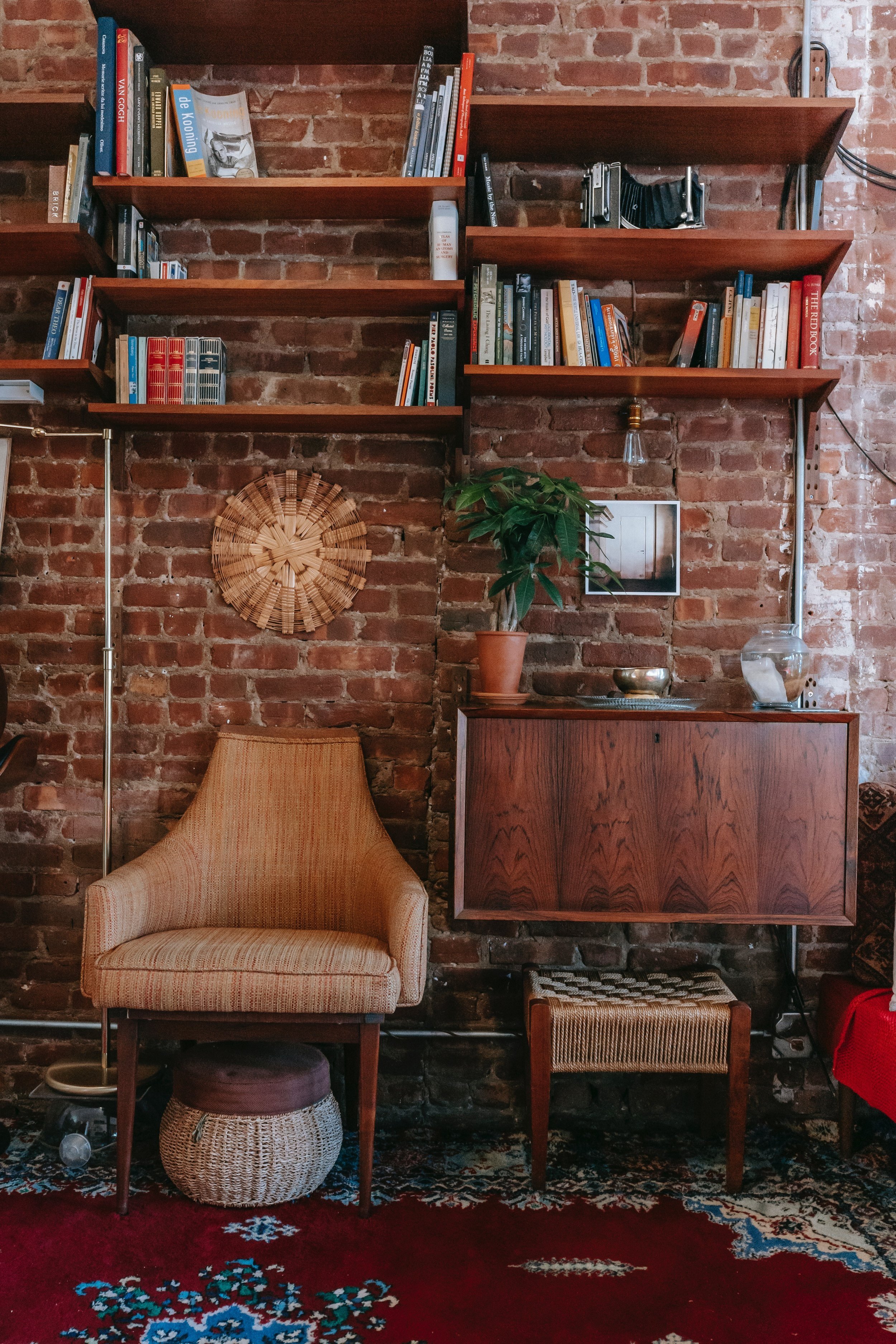
 Victorian homes were often private collections of The eclectic and strange. If you're not interested in building your own cabinet of curiosities (if you are, we'll get to that further down), consider instead using scale. Pair large patterns with smaller paintings or oversized bookshelves in a small room. It gives you the same feeling of drama that the Victorians loved without needing your home to be so cluttered.


Work In The Natural


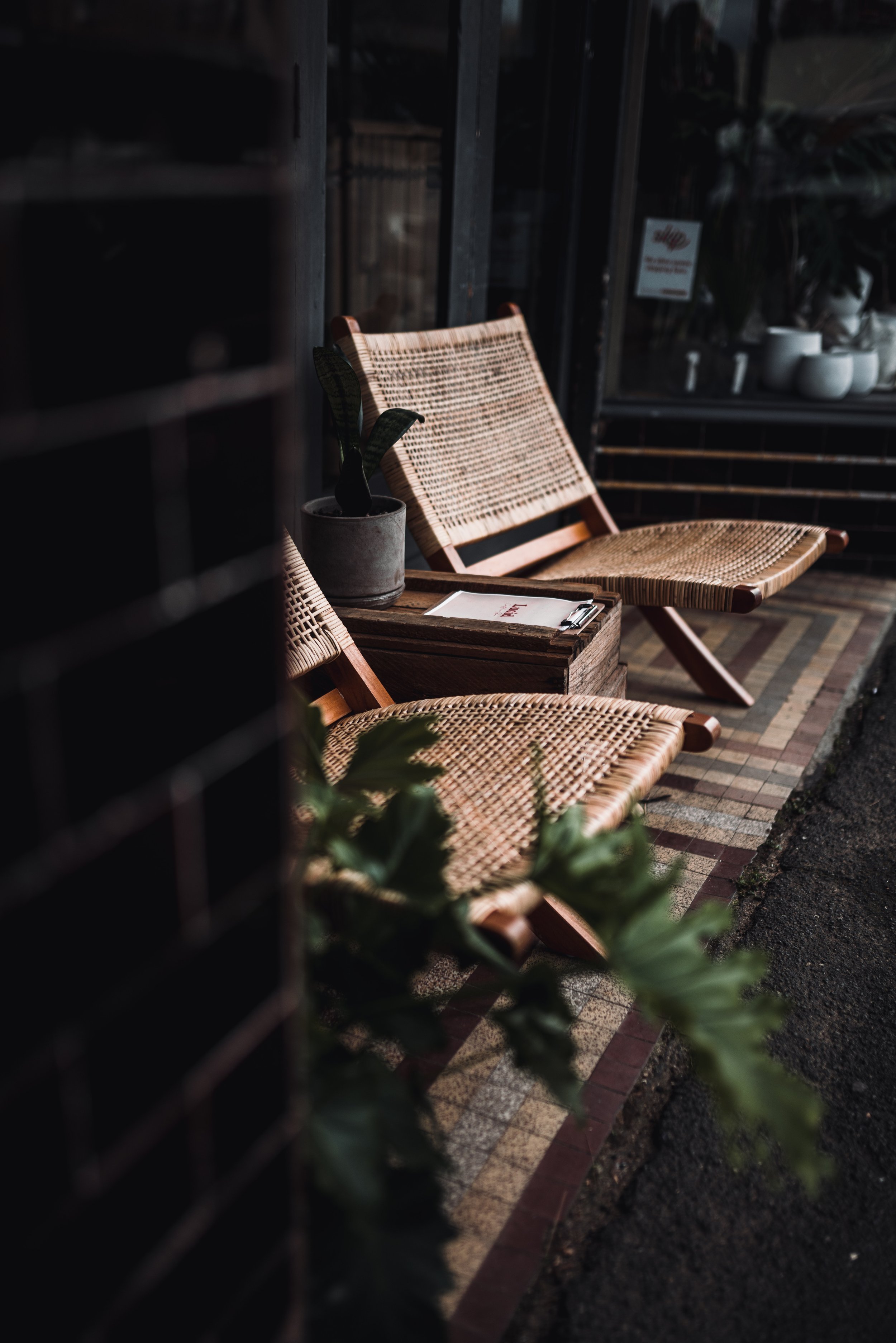
Victorians loved nature from their perspective of manicured gardens to their floor arrangements to their decor. If they could bring in the natural world, they did. It makes sense to find places you can do the same. Can you bring in accessories made from natural fibers? Can you bring in furniture made of wicker or rattan? Do you have a love for botanical drawings that you can frame and hang?


Carefully Curate Your Clutter

Remember how we were talking about curio cabinets? This is that concept. In a Victorian home, you curate what gets displayed, and the rest gets hidden in stylish cabinets. Feature finds from your latest vacation, favored books, or strange things you've discovered over time. 


Go For Bold

On a final note, don't be afraid to go big and bold. Victorian decor was much more colorful than today's styles. Bring in jewel tones and huge patterns; there's no limit. What matters is how you balance these things. 


Are you as in love with Modern Victorian as we are? Let us know over on our Facebook page! 


If you're here because "redoing your home" started because of a flood thanks to your washer, we can help. Reach out to us via phone at ((214) 599-0055) or our contact page, and we will work with you to find a date and time to send one of our expert technicians over. At Appliance Rescue Service, our goal is to help you and get your home running smoothly again. 



Kitchen Trends for 2023

What We See Happening In the Heart of Our Homes

What is in, in 2023, and what's on the way out? This week we're looking at the trends designers are predicting around our kitchens. We're looking at the cabinets, surfaces, paints, and materials. Everything is up in the air this year, with just one thing staying constant, the kitchen is the place to be. 


Cabinet Trends in 2023

Mixed Metals

Courtesy of Vivian Homewares

As we predicted last year, we're seeing lots of different metals and finishes mixing in the kitchen. Stainless is no longer the default; people want brass, bronze, nickel, and more, giving a rich, layered look.


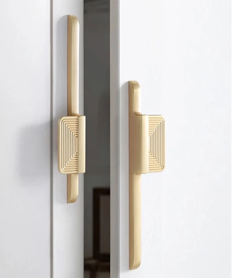
Oversized Hardware

Courtesy of Kulpany Handle store

Many designers, both for cabinets and kitchens in general, are seeing more requests for oversized hardware in the kitchen. Since we are mixing metals so much, it's not surprising that people want the hardware for their drawers, shelving, and doors to get a spotlight.


Creative Cabinet Options

It's no longer about whether your cabinets are recessed versus floating. People are getting creative and going even further against the idea of cabinets being meant only to store and hide items. We're seeing unique and interesting outside designs for them, such as using butcher block cabinets.


Drawers Please! 

Building off the last point, the trend of having only lower cabinets is morphing into having only lower drawers. People want the ability to pull out what's inside the cabinets for easier access, and we don't blame them.


Furniture-Like Cabinets

Courtesy of Homebunch

Because we have more drawers and people want them to look like the rest of this house and make it appear more furniture-like. They're adding details like trim and specific styles of hardware that are seen in other rooms, such as bedrooms or bathrooms.


Sustainability is Going Strong

People also aren't hesitating to use unconventional materials. Sustainable materials are here to stay, and that trend is only getting bigger year after year. Materials like bamboo or wood that's harvested sustainably or built using scraps from other industries. All of these are being experimented with to see what brings the best look.


Surface Trends in 2023


'Soft' materials 

Although this one doesn't apply just to the surfaces within your kitchen, many people are going for more neutral and soft materials. In 2023 we see very neutral colors on the rise, like light oak, linen, and terracotta.


Stone 

Stone is everywhere we look this year. People are loving having stabilized stone in all sorts of unique colors. They're using them on the ceilings or to wrap around their Islands. And they are absolutely right to do so. These stones are gorgeous, and we cannot wait to see where else people use them.


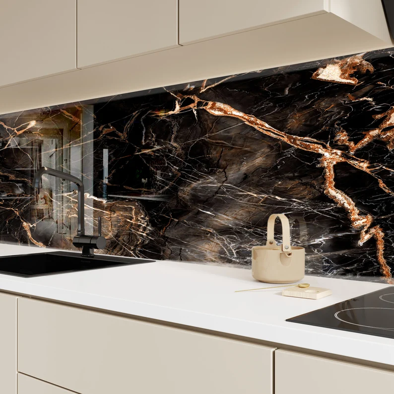
Backsplashes In Solid Pieces 

Courtesy of MyGlassArtworks

Bouncing right off, the last point is using stone or other materials such as wood or resin in one giant slab for the backsplash. Subway tiles are considered to be officially out as of this year. And although we expect to continue seeing them as a trend, at least it seems that having a solid slab is on the rise.


Color Trends in 2023


Bold

With colors being chosen like Viva Magenta, we're seeing that people aren't scared to go bold in their kitchens. More and more unexpected and bold color choices and combinations are being shown off in homes large and small. And this is a trend we don't expect to go away any time soon.


Unexpected Places 

Courtesy of Christie Chase

Just like we called in an earlier post of ours, people are painting the most unexpected places to brighten up their kitchens. It's no longer just your walls or cabinets that deserve the chance to shine. It's your kitchen island. Or the insides of drawers. Or even your ceiling! All of these places and more are a chance to blend together to create a space that is uniquely yours.


Blues and Greens 

Blues and greens are still a very prominent color pairing within kitchen design. As we pointed out last year, people want their homes to be places to shelter to be safe in all aspects. And blues and greens are very calming and soothing colors for many of us.


Brights and Woods 

Right after that, though, there's nothing that says those blues and greens have to be pastels or muted tones. People are absolutely willing to take bright greens or vivid blues and pair them with rich woods. And the pairing works really well. We expect to see this one continue for quite some time as people try out different combinations and different woods come and go in popularity. 


Details and Miscellaneous Trends in 2023


Unique Finds

We've mentioned in the past that people no longer see the point in keeping their personality out of their kitchens; this is another factor that's proving true this year as people are bringing more and more of their art into the kitchen. Whether it's unique finds from their travels, things they've created themselves, or things they've picked up in thrift stores and antique malls, the kitchen is no longer seen as a sterile space. While we expect that pendulum to swing back at some point, it certainly isn't right now.


Statement Lighting 

You need to end custom lighting is another way people are looking to dress up their kitchens. 

Courtesy of Tomer Boutique

Instead of using recessed can lights, as has been done since the early 2000s, people see the value in having statement lights again. And when so many can be used to accentuate or highlights the colors and metals that surround them in the rest of the kitchen, it makes complete sense. We expect this one to stick around for quite some time. 


Recessed Outlets 

One thing that is being hidden away, though, is our electrical outlets! While having proper outlet placement in the kitchen is extraordinarily important, we find that the need for outlets that stick out is not nearly as appealing to us. We have showcased different options for recessed outlets in the past, and we're excited to see those and other options being made available to the common market.


What about you? What trends are you seeing in your neighborhoods? What are you excited about? What are you curious about? What are you bothered by? What trend do you wish would come back? Let us know in the comments below or over on our Facebook page. As always, we love hearing from you, and we want to know what your thoughts on the matter are.


If you've wound up on our site because your kitchen appliances are malfunctioning, fret not! Give us a call at ((214) 599-0055) or head over to our contact page. At Appliance Rescue Service, we'll work with you to find a date and time that works for your schedule. Our top goal is to get your home running smoothly again.
Top Tips to Achieve Scandinavian Design In Your Home

 How To Make Your Home Look Like A Hygge Getaway

With winter coming in fast, many people are looking at the neat designs of places that have winters far more brutal than here in Texas. With that sort of idea in mind, we would like to bring your attention to the warmer and more cozy cousin of modern minimalism: Scandinavian design! Whether you’ve never heard of it, or you’re looking for tips to get started, this is the article for you. 

What is Scandinavian Design


Many people's first question is what is Scandinavian design and “where does it come from?” 

Scandinavia is made up of three European countries located far to the north: Norway, Denmark and Sweden. 


Scandinavian design comes from the fact that houses are usually on the smaller side, and people are stuck in their houses for long periods of time in winter. From these two facts it makes sense that the style consists of clean lines, and a lack of clutter  Functionality without sacrificing beauty is a key concept, because you're going to be staring at it quite a bit and there just isn't room for things if they don't serve a purpose. Scandinavian style also favors bright, airy spaces and a focus on nature, unlike it's stylistic cousin, minimalism, which is drawn more by darker colors and the division of spaces. A final important factor is texture. If something is soft, warm and fuzzy? It's probably a good fit for Scandinavian design. Think of things like faux fur carpets, thick plush blankets, and soft pillows. All things to keep you warm and cuddle up in after a long cold day. 

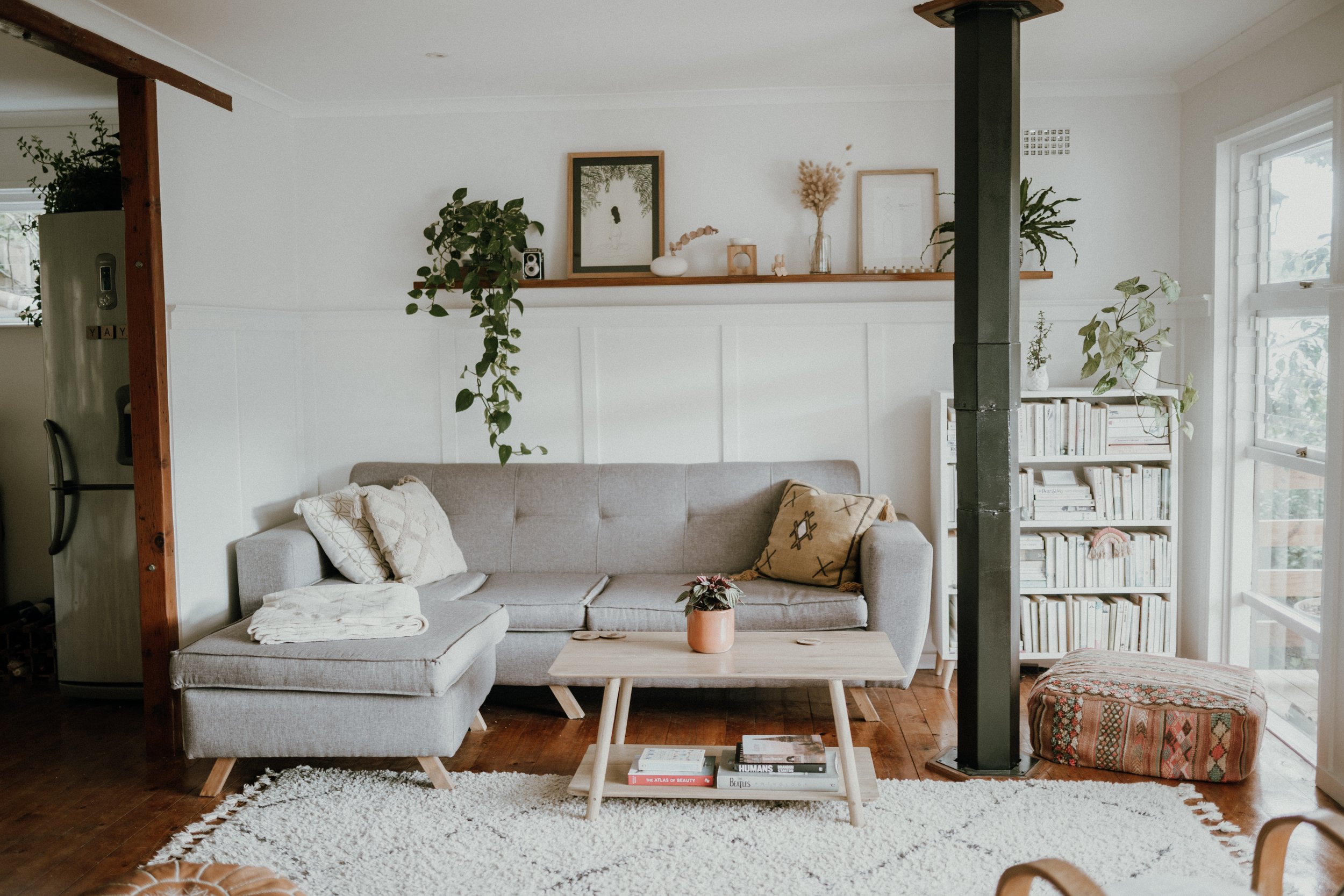
A Scandinavian living room, painted white, with shades of warm wood and multiple plants, and covered in multiple different textures is the epitome of Scandinavian design

Courtesy of Teryn Elliott

.

How To Achieve Scandinavian Design In Your Home 


Play with Natural Light

Because light is so limited that far north during the winter, it's especially important to find ways to make the most of it. So, play up the windows, bring in lamps that imitate natural light and make the most of the light you do have. It also means keeping your surroundings bright and possibly playing with mirrors to maximize light as it comes in. 

a white room holds multiple examples of reflected light and sunlight bulbs as well as mirrors, making the most of Scandinavia's limited winter light

courtesy of Decorilla


Use Warm Wood

Warm woods like oak, and spruce, pine and birch  are great for this design style. All of them are light colored woods that add to the feel of both merging with nature and also keeping your space light and airy. 

a dining table is central to the photo, stained a light color and the floor mimics it, balancing the white of the walls

courtesy of Decorilla


Light, Muted Colors Overall with Small Pops 


We keep talking about how long and dark the winters are and we're not done. In order to keep your home bright during the winter, Scandinavian style would have you paint your walls white and use mostly muted or soft colors to keep everything feeling cohesive. You can however make choices of natural brighter colors and incorporate those throughout, so long as they’re in small doses. 


Clean Lines

When it comes to furniture, light fixtures etc, go for things that are clean and natural lines. Overly complicated designs are not something that meshes with Scandinavian design . 


Think Cozy

As we mentioned up top, winter is long and miserable in Scandinavia. Even if winters are mild here in Texas, you can fudge this one a little and still get the look. Get accent carpets of faux fur. Get pillows and blankets that are wonderful to curl up with even on stormy days. Think of what cozy means to you and bring that in. 


Mix Textures

Building on the last one, use multiple textures in your decor. Bring in soft and silky, chunky knits and plush throws. Layering textures like this helps to add to the cozy atmosphere you're building.

A nursery in shades of white and grey has a multitude of soft textures and pillows layered throughout the room.

Courtesy of Decorilla

Clutter Free Spaces

Although newer houses are being built larger, houses were typically built on the smaller side as it was easier to heat during the winter. A side effect of that meant that they didn't allow for excessive amounts of stuff. So you won't see much in the way of clutter in most Scandinavian homes. 


Greenery

To help bring life into the home, quite literally, plants are found in many Scandinavian homes, even in the depths of winter. 

Several different plants are grouped together on and around a side table


And that’s a wrap! What do you think? Are you interested in bringing Scandinavian design into your home? Let us know your thoughts in the comments below or over on our Facebook page. 


And as usual, if you didn’t wind up here because you’re looking for decor ideas, but because your appliances are malfunctioning, let us know! At Appliance Rescue Service, our goal is getting your home running smoothly again, whether it’s your dryer or your oven that’s malfunctioning or your ice maker has decided to just stop working. You can reach out to us on our contact page or by giving us a call at ((214) 599-0055). Wherever you are in the Dallas Metro Area, we’re here for you.

Keys To Mid-Century Modern Design

Whether You're Just Looking Or You're All In, These Are The Keys To Design For Your Home

Do you miss the simplicity of the 50s? Or maybe you're just tired of the cluttered look of modern decor? If you said yes to either of these questions, Mid-Century Modern decor might be for you. Don't fret if it's not something you're familiar with, though, as we're going to explain where Mid-Century Modern came from, what Mid-Century Modern focuses on, and ten tips for how you can implement Mid-Century Modern in your home. 


Mid Century Modern was a concept that, unsurprisingly, rose to popularity in the middle of the 20th century. The world was changing at such a pace, and people were trying to carve out something that was new.  It was heavily influenced by the German school of design and architecture, Bauhaus. At this time, the school emphasized clean lines, functionality, and a futuristic look. 


These three components came to shape the core concepts of  Mid Century Modern design, along with a few others. These included the fusion of the organic and manmade, muted tones and seamlessly combining the indoors and outdoors. 


If you're looking to learn a bit more about Mid Century Modern, check out some of the designers who were famous for it. 

Eero Saarinen

Charles & Ray Eames

Isamu Noguchi 

George Nelson

Cara Greenberg

Arne Jacobsen

Herman Miller


Let's take a look at ten tips that you can use in your home today to start putting together the Mid Century Modern look of your dreams. 

1) Fusion of Indoor and Outdoor

Bring plants into your home, not just on the edges or the porch. They should be incorporated throughout the decor, as MCM is all about breaking down the separation between inside and outside. Another way to bring that in is having window treatments that leave as little separation between you and the outside world as possible. 


2)  Use Size To Your Advantage

When it comes to space, having more space typically makes us more comfortable. So to bring that feeling to a room, use furniture that's smaller. Using smaller pieces in neutral tones not only highlights your statement piece but also allows the furniture to fade into the room, providing a more spacious feeling. 

3) Vary The Height Of Things Within The Room

When you look into a room, you don't want everything to be at one equal height. Whether it's decor on the walls, furniture, or decorations,  mix things up. 

4) Natural Colors With Pops Of Color 

It doesn't have to be all black, white, and wooden in order to be Mid Century Modern. Bring in some color! Use natural tones (again focusing on the incorporation of nature) and then add a splash of color. 

5) Minimalism 

An bedroom with a pair of open balcony doors is framed by grey curtains, while the bed is made in grey and white bedding, showing off minimalism.

Courtesy of StuBailey

This sounds like a very simple concept. 'Just chuck everything out and only buy what you need." Except... how many of us are good at living like that? 

The thing is, minimalism doesn't have to be getting rid of everything. It's about reducing the clutter and having open, functional spaces. Furniture is simple with sleek lines, without much in the way of ornamentation. 


6) Keep It Functional

Unlike some other styles, Mid-Century Modern wants everything to be functional. If it doesn't have a purpose, it doesn't belong. The flip side of that is that every functional item in your home is also uniquely beautiful because of that. It's a difficult balance to maintain in our fast fashion world, but when you're committed to the design, it's worth it to hunt down pieces that fit the concept. 


7) Mixing Materials 

Just like we want to bring in the outdoors, we want to bring in a balance of man-made vs. natural. Woods and metals, leather and velvets, the consistent interplay between the two is part of the fun. 


8) Velvets

Courtesy of yaoyaoyao5yaoyaoyao

Picking right up from that last point is a material your Blogger loves, velvet. While texture can be said to be an important part of any decorating scheme, velvet holds a special place for Mid Century Modern. This is a lovely way to escape and relax while still holding to the minimal feeling of the design. 

9) Build Each Room Around Statement Pieces 

Courtesy of Steven Miller

For each room, pick 1-2  pieces that really stand out and fit the concept of Mid Century Modern as you see it.  Work around those pieces for the rest of the room to mimic, contrast or highlight them. Bring in colors that complement or contrast them. Bring in other shapes that highlight that one. Bring in textures that are similar. It all ties back together to focus on the piece you’ve chosen. 


10) Choose Statement Lighting

For our last point, make sure to choose lighting with some oomph for your rooms. Light, and the lighting we choose, is just as much a part of a room as the furniture or walls. So, the light fixtures that you choose should stand out just as much. 


And that's a wrap! What do you think? Are you interested in learning even more about Mid Century Modern decor? Or have you decided it's not for you? Let us know in the comments below or over on our Facebook page. 


While you definitely can fit your laundry room and kitchen into a Mid Century Modern design, we know that's not why everyone lands on our website. If you're having issues with your refrigerator or your oven, reach out! You can get hold of us on our contact page or by giving us a call at ((214) 599-0055). No matter which of your major appliances is on the fritz, Appliance Rescue Service will work with you to figure out what the problem is and work with you to get it running smoothly again.


Our 9 Favorite Home Design Trends For 2022

Here Are The Trends We're Hoping Make It Big This Year 


Table of Contents

Closed Floor Plans

Parisian Inspired Interiors 

All Of The Texture

Colorful Tableware

Curved Furniture

Resourcefulness/Sustainability

Home Bars

Patterned Floors

Where  Did The Cabinets Go?

It's that time of year again when we're all trying to figure out who's doing what with their homes. Are open floor plans in or out? What about all-white kitchens? Are we still doing cottage chic or is it fairycore this year? When you're looking at your house at the beginning of the year, it's easy to be distracted and overwhelmed, trying to figure out what you want to do. Trends come and go and you have to figure out what you want your home to look like. What aspects of you that you want to show off. It's fun to just look through and see what you like vs what you don't. That's what this week's post is taking a look at our top 9 design trends that we think are going to go big this year.

Photo Credit: Redfin.com

Closed Floor Plans

We mentioned this one in our trends for 2021 and we weren't wrong! As our homes do more and more work, we're learning to partition them into different spaces to serve those needs. Being able to mentally partition them also means that we're less likely to get distracted as we work in those different spaces, or be as stressed from the overlapping segments of our lives.


Photo Credit: Hommes Studio

Parisian Inspired Interiors

Just because most of us haven't been able to make use of our passports, doesn't mean we can't dream. One of the rising trends right now is a modern take on Parisian interior designs. Think of an open room with lots of natural light. Bring in pastels and metallics to create the look, and hints of colored crystal and glass to make the room glow. If you want more ideas, check out this article we found over at Shelterness for how to pull off the look in your own space.

Layered rugs of a woved fiber and a soft faux fur

Photo Credit: The Fox & She

All Of The Texture

Whether you're looking at a calming sea of neutrals or a riot of colors, texture can make a room feel more inviting. We're going to see more and more of that this year, and not just in terms of throws and pillows. Everything from woven furniture and decor to layers of velvets and cottons brings a very welcoming atmosphere to a room.


Colorful Tableware

Have you ever realized how much time you spend at your dining table? Yes, everyone is different here, but a lot of us have started to spend more time at our dining tables again to just enjoy food and being with each other. Between that and the uptick in small at-home gatherings, people are realizing again that how you set your table says just as much about you as what you serve. You can express all sorts of things about your home just by how your decide to set your table, from colors to patterns, to materials. And companies have noticed that. More and more you're able to pick up mix and match flatware, tableware, glasses, napkins and more. The best thing? You don't have to finish a set all at once, or at all if you're not into it. If you want to just pick up a few pieces here and there, you can do that to grow your collection. If you want to grab the flatware from this set and the glasses from that one and salad plates from a third? Go for it. This is all about you. You can even start with small things like napkins, candlesticks and salad bowls if that's an easier place for you to start.

Curved Furniture 

This one was big in 2021 and we don't see it changing this year. We're still going hard on the idea of making our homes softer and more comfortable as we try to deal with the way the world is. So why shouldn't our furniture reflect that? We think we'll continue seeing this not only in how soft furniture is or how cushioned, but also in the overall shapes of different pieces. Backs, arms and even the overall shape of furniture will continue becoming more rounded, which all of our toes and shins should be thankful for.  Although it definitely makes it more difficult to plan in a square house, we're excited for where this trend is going.


reclaimed wood cabinet

Resourcefulness/Sustainability 

You've heard us talk about the microchip shortage before, and that's unfortunately still going on, as are supply chain issues. What's interesting is that this shortage of material is having a boom in terms of crafting, recycingl and reusing things we already have. So many people are remaking and updating many different things they already have into entirely new types of home goods. 

It's also meaning that people are taking a closer look at where the things they're purchasing are coming from. They want to see where materials are sourced from, and that they're designed with sustainability in mind from beginning to end. 


Photo Credit: House Beautiful

Home Bars

Whether you're going for a dry or wet bar, we see these becoming a very integral part of home decor and life again over not just the next year but the coming decade. Especially since companies are coming up with things like the at home bar system like the Barsys 2.0 Cocktail Machine.  At home bars are a great way to have a few close friends over to sit and relax without having to worry about pandemics or overly loud bars.


Photo Credit: Interior Design Trends

Patterned Floors

If you're looking at adding texture to a room, but you're not sure where to start, a great option is with your floors. Work from the ground up to transform a room, and you'll know that you're standing on solid ground. Ok, we're done with the puns. 

More seriously though, why restrict patterns to countertops, backsplashes and the walls? We've said before that your ceilings and floors add just as much to a room as those areas, so you might as well utilize them. Fortunately, there are plenty of ways that you can do just that. 

 You can bring in all sorts of influences in without having to bring in furniture, textiles or even paint.  Instead, grab some peel and stick reusable tiles for your floors. Whether it's your kitchen or your bathroom, your living room or parlor, there are so many different options available to you.  Or you could work with reclaimed materials to piece together a pattern entirely unique to your home.  Check out flea markets to grab some great reclaimed materials, that you can then give new life.


Photo Credit: Best Online Cabinets

Where Did The Cabinets Go? 

We will happily admit we didn't see this one coming when we were looking at trends last year. So many people talk about not having space for storage in their homes, and yet people are getting rid of their upper cabinets. It might be because people are wanting to simplify their homes and reduce the amount of clutter. Alternatively, it might be because then you have less space to clean if there aren't any cabinets. Whichever it might be, expect to see more of this trend throughout the year ahead as kitchens in new builds and magazines ditch the upper cabinets. 


That's it for us, our top ten trends of the year that we're looking forward to seeing more of. What about you? Were you surprised by any of these? Do you think we're wrong? Let us know over on our Facebook page or in the comments down below! We want to hear your take on the trends of 2022. 

If you're tired of talking trends though and just want something that works, we can still help. If you've got an oven that won't hold heat or a washer that leaks, we can help. Give us a call at ((214) 599-0055) or visit our contact page to set up an appointment. We'll work with you to diagnose and fix the problem so that your home can start running smoothly again.  We serve everywhere between Dallas and McKinney, from Coppel to Garland, and we're here to help you. 


Additional Reading 

Top 7 Kitchen Trends of 2021

2020 Design Trends: Big Or Bust?

2000s Kitchen Decorating Trends That Overstayed Their Welcome

So What If They Can’t Get Their Chips? 

5 Kitchen Tools From The Future