Kitchen Trends for 2023

What We See Happening In the Heart of Our Homes

What is in, in 2023, and what's on the way out? This week we're looking at the trends designers are predicting around our kitchens. We're looking at the cabinets, surfaces, paints, and materials. Everything is up in the air this year, with just one thing staying constant, the kitchen is the place to be. 


Cabinet Trends in 2023

Mixed Metals

Courtesy of Vivian Homewares

As we predicted last year, we're seeing lots of different metals and finishes mixing in the kitchen. Stainless is no longer the default; people want brass, bronze, nickel, and more, giving a rich, layered look.


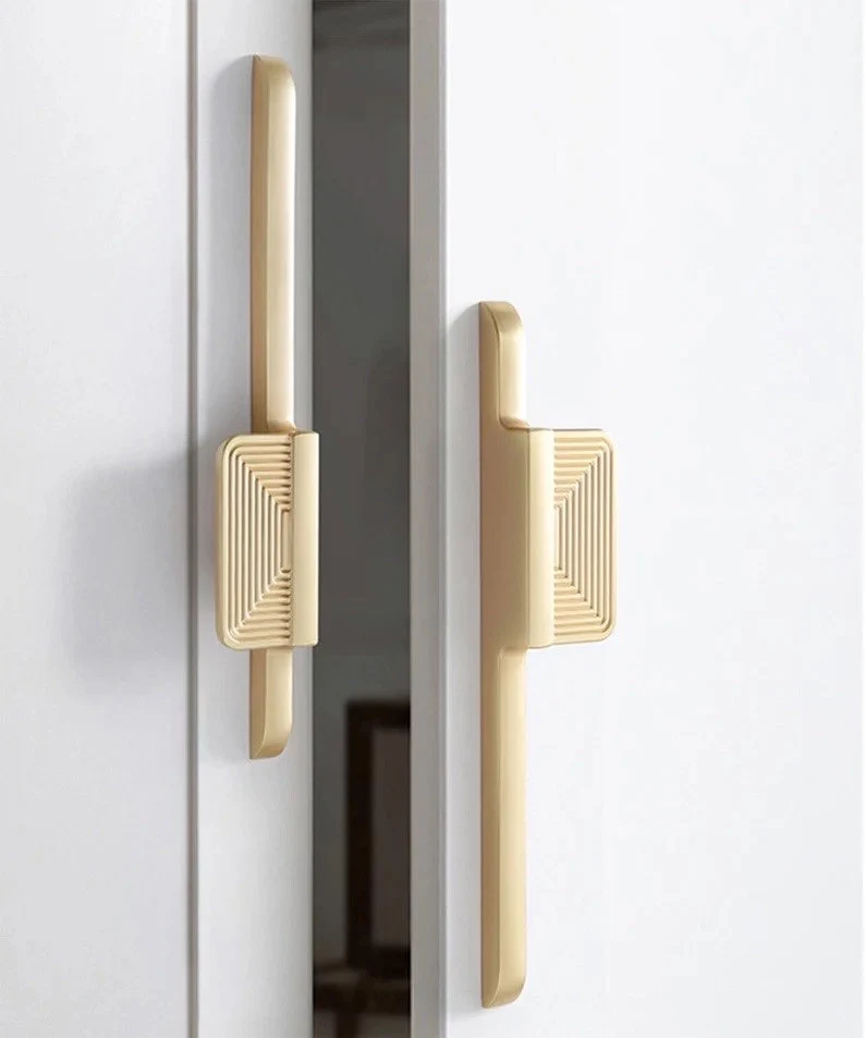
Oversized Hardware

Courtesy of Kulpany Handle store

Many designers, both for cabinets and kitchens in general, are seeing more requests for oversized hardware in the kitchen. Since we are mixing metals so much, it's not surprising that people want the hardware for their drawers, shelving, and doors to get a spotlight.


Creative Cabinet Options

It's no longer about whether your cabinets are recessed versus floating. People are getting creative and going even further against the idea of cabinets being meant only to store and hide items. We're seeing unique and interesting outside designs for them, such as using butcher block cabinets.


Drawers Please! 

Building off the last point, the trend of having only lower cabinets is morphing into having only lower drawers. People want the ability to pull out what's inside the cabinets for easier access, and we don't blame them.


Furniture-Like Cabinets

Courtesy of Homebunch

Because we have more drawers and people want them to look like the rest of this house and make it appear more furniture-like. They're adding details like trim and specific styles of hardware that are seen in other rooms, such as bedrooms or bathrooms.


Sustainability is Going Strong

People also aren't hesitating to use unconventional materials. Sustainable materials are here to stay, and that trend is only getting bigger year after year. Materials like bamboo or wood that's harvested sustainably or built using scraps from other industries. All of these are being experimented with to see what brings the best look.


Surface Trends in 2023


'Soft' materials 

Although this one doesn't apply just to the surfaces within your kitchen, many people are going for more neutral and soft materials. In 2023 we see very neutral colors on the rise, like light oak, linen, and terracotta.


Stone 

Stone is everywhere we look this year. People are loving having stabilized stone in all sorts of unique colors. They're using them on the ceilings or to wrap around their Islands. And they are absolutely right to do so. These stones are gorgeous, and we cannot wait to see where else people use them.


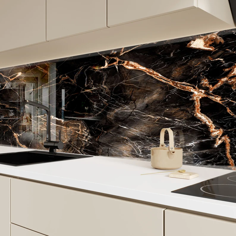
Backsplashes In Solid Pieces 

Courtesy of MyGlassArtworks

Bouncing right off, the last point is using stone or other materials such as wood or resin in one giant slab for the backsplash. Subway tiles are considered to be officially out as of this year. And although we expect to continue seeing them as a trend, at least it seems that having a solid slab is on the rise.


Color Trends in 2023


Bold

With colors being chosen like Viva Magenta, we're seeing that people aren't scared to go bold in their kitchens. More and more unexpected and bold color choices and combinations are being shown off in homes large and small. And this is a trend we don't expect to go away any time soon.


Unexpected Places 

Courtesy of Christie Chase

Just like we called in an earlier post of ours, people are painting the most unexpected places to brighten up their kitchens. It's no longer just your walls or cabinets that deserve the chance to shine. It's your kitchen island. Or the insides of drawers. Or even your ceiling! All of these places and more are a chance to blend together to create a space that is uniquely yours.


Blues and Greens 

Blues and greens are still a very prominent color pairing within kitchen design. As we pointed out last year, people want their homes to be places to shelter to be safe in all aspects. And blues and greens are very calming and soothing colors for many of us.


Brights and Woods 

Right after that, though, there's nothing that says those blues and greens have to be pastels or muted tones. People are absolutely willing to take bright greens or vivid blues and pair them with rich woods. And the pairing works really well. We expect to see this one continue for quite some time as people try out different combinations and different woods come and go in popularity. 


Details and Miscellaneous Trends in 2023


Unique Finds

We've mentioned in the past that people no longer see the point in keeping their personality out of their kitchens; this is another factor that's proving true this year as people are bringing more and more of their art into the kitchen. Whether it's unique finds from their travels, things they've created themselves, or things they've picked up in thrift stores and antique malls, the kitchen is no longer seen as a sterile space. While we expect that pendulum to swing back at some point, it certainly isn't right now.


Statement Lighting 

You need to end custom lighting is another way people are looking to dress up their kitchens. 

Courtesy of Tomer Boutique

Instead of using recessed can lights, as has been done since the early 2000s, people see the value in having statement lights again. And when so many can be used to accentuate or highlights the colors and metals that surround them in the rest of the kitchen, it makes complete sense. We expect this one to stick around for quite some time. 


Recessed Outlets 

One thing that is being hidden away, though, is our electrical outlets! While having proper outlet placement in the kitchen is extraordinarily important, we find that the need for outlets that stick out is not nearly as appealing to us. We have showcased different options for recessed outlets in the past, and we're excited to see those and other options being made available to the common market.


What about you? What trends are you seeing in your neighborhoods? What are you excited about? What are you curious about? What are you bothered by? What trend do you wish would come back? Let us know in the comments below or over on our Facebook page. As always, we love hearing from you, and we want to know what your thoughts on the matter are.


If you've wound up on our site because your kitchen appliances are malfunctioning, fret not! Give us a call at ((214) 599-0055) or head over to our contact page. At Appliance Rescue Service, we'll work with you to find a date and time that works for your schedule. Our top goal is to get your home running smoothly again.

Hollywood Regency Decor: How To

How to Bring The Glamour To Your Home

If you’re looking for a new decor trend to match your outgoing personality, Hollywood Regency is it.  Even if you’re keeping your parties small, there’s nothing that says your style has to be. Hollywood Regency is all about glamour, sophistication and elegance in the home. 

Hollywood Regency style came about during the Golden Age of Hollywood and reflects the charm and sophistication of the 1930s. It mixes together the Art Deco glitz and glamor with  mid-century modern’s clean lines and throws in Victorian elements like velevets, tufting and bold color palettes. Roll all of that together and you’re starting to get the idea of Hollywood Regency. This isn’t a quiet design style. This is dramatic and bold, all about making a statement about who you are and what you like.  Hollywood Regency was inspired by the over the top interiors that designers created for the silver screen.


 The Hollywood royals loved the look of the polished glamour that they worked in and wanted to bring that into their homes. They employed iconic designers like Paul R. Williams, Dorothy Draper, and William Haines to create their homes, and they went big! They brought the same designs that looked great in black-and-white and brought in the attention to detail, color, texture, and finishes that make Hollywood Regency what it is. 


So how can you replicate it yourself? You might not be able to get Dorothy Draper or William Haines to decorate your home, but you can still get the looks that they created by paying attention to a few rules. 


1) There Is No Such Thing As Too Glamorous

This is the top rule for this style. Sumptuous fabrics, rich textures, layers of details, and luxurious accents. Think of it as opulent as a Queen’s jewel box and as comfy as you can make. Hollywood Regency doesn’t take itself seriously, so if you feel like you’re going over the top, you’ve nailed it. 

A room painted in black and framed in golden panels has three golden spiked lights hanging from the ceiling, with square cream sofas placed front and center. One is directly in front of the viewer and one is to the left and right.

Courtesy Inspiration Design Books


2) Be Strategic With Your Placement

Although you’re looking to create the opulent look, you don’t want your colors to clash. There should definitely be a singular color palette for each room so that it can be relished in, rather than run from.  Keep patterns to one or two in a space so that they don’t fight with each other, and stick to just one type of metal.  They look great on their own, so you want them to shine when you do highlight them. 


3) Keep Your Furniture Small-Scale

A golden frame of bars wraps around two cushions to form a chair with thin legs. It looks uncomfortable if we're honest.

Courtesy Everly Quinn

While it might sound strange, the furniture isn’t meant to be the feature point of the style. Hollywood Regency is all about open floor plans and parties, so having plenty of space to move is important. Instead, look to bright, glossy furniture with lacquered surfaces so that each piece pops. 


4) Pay Attention To Your Details

A mirror is framed in a bronze sunburst with irregular spikes making up the rays of th sun

Courtesy of Ballard Designs

Like we said in the last point, the furniture doesn’t command the space, so your decor is what does. Luxurious fabrics, metal hardware, crysta lights and objects de art are the requirement of the day. Velvets, silks and furs, Turkish rugs and golden hardware and patterns.  It’s about making things sparkle and shine. You can even bring in mirrors as wall decorations, shaping them into a larger sculpture or art piece. 


5) Don’t Be Afraid To Grab Inspiration From Other Eras

A golden wall panel in three parts is painted on the wall,  made up of three arches filled with curls and swirls and connected arches

Courtesy Simple Shapes

Hollywood Regency was inspired by a large number of different eras, so don’t be afraid to pull in other concepts. Rococo and Chinoiserie are both styles that mesh in nicely in different ways and blend well with the glamour of Hollywood Regency. 


6) Bring In The Black And White To Temper Things

Another key mark of Hollywood Regency is the use of black and white in different ways. Whether it’s checkerboard flooring, large photography or zebra prints even, there are many ways you can fit this into your home to create a quieter corner amid the opulence. 


7)  Don’t Shy Away From Lacquer

A deep teal lacquered cabinet with thin lower legs and an ocatagonal raised pattern on the doors

Courtesy of Ellen Quinn

With the love for all things shiny, lacquered finishes are just the thing to fit in with Hollywood Regency. Whether you apply this to furniture like tables, to room dividers or accessories like trays and vases, or to your walls or ceilings, get creative with it. There’s nothing that’s off limits for this one. 


You can probably tell we LOVE Hollywood Regency and the luxe feeling it brings. What about you? Do you think you’ll be doing up your home in Hollywood style this spring? Let us know in the comments below or over on our Facebook page! As always, we love to hear from you. 


If you wound up here looking for help with your dryer and not your decor, no worry, you’re still in the right place. Whether you’re in McKinney or The Colony, we’re here to help get your major appliances running again. We’ll work with you to find a time and date that works best for your schedule. At Appliance Rescue Service, our goal is to get your home running smoothly again. You can reach out to us via our contact page or by giving us a call at ( (214) 599-0055). 


Top Tips for Achieving Coastal Decor

 Let’s Get Beachy!

The coast is something that calls to many of us, the warm sand, the cool, crashing waves, and the salty air. However, not all of us can live on the coast, for one reason or another. When that is the case, coastal decor can be a next best thing. If that’s what you’re craving, check out our tips for how to decorate your home in coastal decor and bring out the place you love. 

Start with the colors


Bring in the colors of the coast you’re thinking of.
Is it the white shores and pale green waters you long for? 

Or do you love the iron sky, deep stormy blues and beige of the Atlantic? 

Or maybe it’s the tropical colors of coral reefs and bright fish that you love? 

Whatever it is, build up your color palette first. This is going to be what you work from for building your space. Many look to beiges, warm grey, ivory, and white for walls and trim and then bring in dusty blues and greens. We say, find a few photos of the ocean that you love and build from there. After all, it’s 2023! Who says you can’t paint your walls or door a stunning blue or a vibrant coral? No one. Certainly not us. 

 Keep Your Curtains Light 


By this, we mean both in terms of color and, just as importantly, fabric. 


Whether you live on the coast or just wish you did, light curtains are a must. The floaty fabric serves multiple colors. It helps to allow air in when you’re trying to coax a breeze in. It also keeps a room bright and open if you chose to go with darker wall colors

A soft twin sized bed is covered in pillows, throw pillows and blankets. The walls are white shiplap and the curatains are light and floaty

Credit: Wayfair

Go For Hardwood Floors

    Or at least the appearance of them 


Whether you choose hardwood, bamboo, vinyl or a good sticker, the look is key. You can evoke sandy beaches and driftwood by choosing the right flooring in color or texture. Alternatively, you could go for more of a ship or pier feeling with darker stained wood. 


Textures! 

Keep furniture as smooth long lines. Then for storage, side tables and the like, bring in textures. Rope baskets, rattan accents, white-washed ceiling beams. Doing this gives you freedom to play, without having to replace large pieces. 


It doesn’t have to be cluttered

You don’t have to have knickknacks everywhere in order to make a room coastal. YOu can choose tight, focused decor to get the idea across or you can choose furniture and accents that do the same.  It’s not just rass bells, anchors and signs proclaiming “beach life.” 


Other decoration ideas: 

Bottles in blues, greens and browns on a high shelf. 

-Throws that work with the color scheme you’ve chosen. 

-Maps of all sorts, especially ones that show oceans, currents or islands. 

-3D printed coral 

     Getting it 3D printed means it will not only make it last longer but it will also not contribute to the death of coral reefs. 

-Driftwood

-Mirrors to bring in the light and airy feeling of the room. 

A living room with light curtains, a mirror, palm fronds, and  shades of blues and greys

Credit: Wayfair


Paint Your Kitchen Island 

It might sound odd, but your kitchen island can be another wall to show off your color palette. And if you choose to paint it blue, you can make a very quiet ‘island’ pun, without ever saying a word. 


Don’t be afraid to get creative 

 Take ‘traditional’ concepts of coastal decor, and find ways to work them into your space in new and creative ways. 

  • Use a pattern that mimics a rope net, like houndstooth in a brown or beige color, against a black or blue background. 

  •  Take colors from your palette and use them in an unexpected place, like a set of airy coral curtains around your bed. 

  • Your planters can add to the look as well. You might not be able to grow coastal plants in the DFW area, but you can paint your planters in shades that reflect the beachscape. 

Credit: The Nursery


What are your opinions on coastal decor? Are you interested in using it in your own home? Have you already? Let us know that or your favorite tip over on our Facebook page, or in the comments below! 


If it’s not ‘beach,’ you’re thinking of but instead ‘waterfall’ as in “my washer overflowed and ruined my laundry room,” we can help. At Appliance Rescue Service, if you’re struggling with your washer and dryer, we’re here for you. Whether you’re looking for someone to fix that washer-based waterfall, or your dryer is squeaking so loud you thought you had a seagull, we’ll figure it out. We’ll work with you not just to find a date and time, but also to find what the problem is and make sure that you’re satisfied. You can reach out to us via our contact page or by giving us a call at ((214) 599-0055) to set up an appointment today.

Viva Magenta! Pantone Color of the Year 2023

A Showstopping Color That Gives Rise to Bold Expression and Comfort Simultaneously

It's that time of year, when everyone is excited about the new Color of the Year from Pantone.  Pantone influences many different fields including beauty, marketing, and most importantly to us, home decor and design.  


Before we show off the new color though, how does Pantone choose the color? Just how did they decide?  According to Laurie Pressman, the Vice President of Pantone Color Institute, "To arrive at the selection each year, this global team of color experts at the Pantone Color Institute comb the world looking for new color influences. This can include the entertainment industry and films in production, traveling art collections and new artists, fashion, all areas of design, aspirational travel destinations, new lifestyles, playstyles or enjoyable escapes as well as socio-economic conditions. Influences may also stem from new technologies, materials, textures and effects that impact color, relevant social media platforms and even upcoming sporting events that capture worldwide attention." Pantone created a color language that everyone across many different industries can use to ensure that everyone knows exactly what color they're talking about, and more importantly how to replicate it. They also do research across many different cultures to  find how and why colors affect us the way they do. All of this together means that they are very good at choosing colors. 


What Is The Color? 

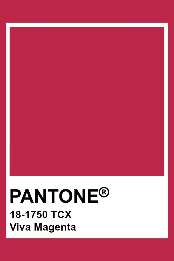
The Pantone frame lays over the Viva Magenta swatch with the name and the color formula

Credit: Pantone

All of that said, this year's color is a showstopper. This year's color is Viva Magenta! (18-1750) A vibrant and stunning red that according to Pantone "encourages experimentation and self-expression without restraint." It is a balanced tone between warm and cool colors. Viva Magenta is a modern color for the Post-Pandemic world but one that is deeply rooted in the past.


What Does It Draw Inspiration From? 

Viva Magenta is a riff on carmine red. This is one of the most expensive and valued dyes of the natural world. It comes from cochineal insects, and their shells. Hundreds of thousands of these beetles would be collected and ground up in order to create the color, for dyes and paints. Carmine was once a major export from the Americas, and is again a rising economy in that portion of the world. 


What Colors Does It Pair Well With? 


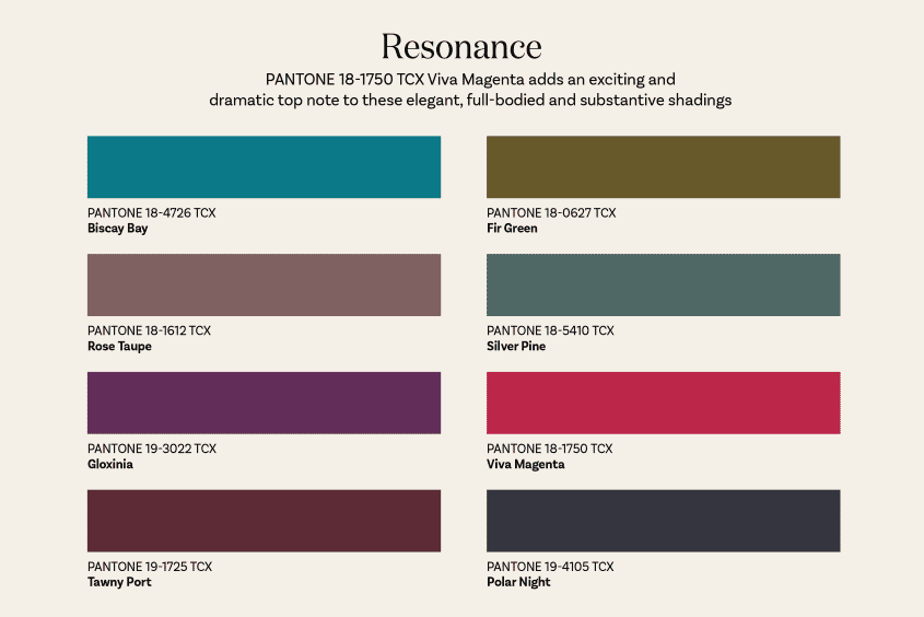
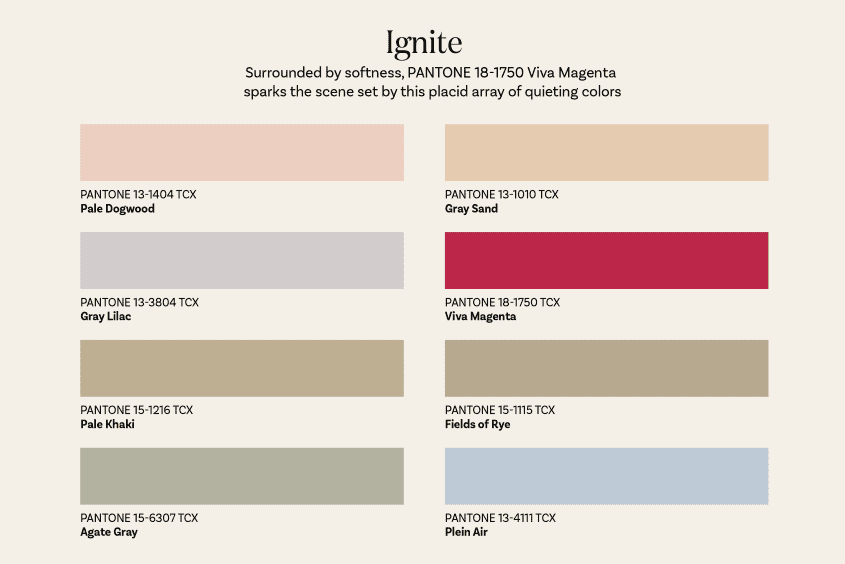
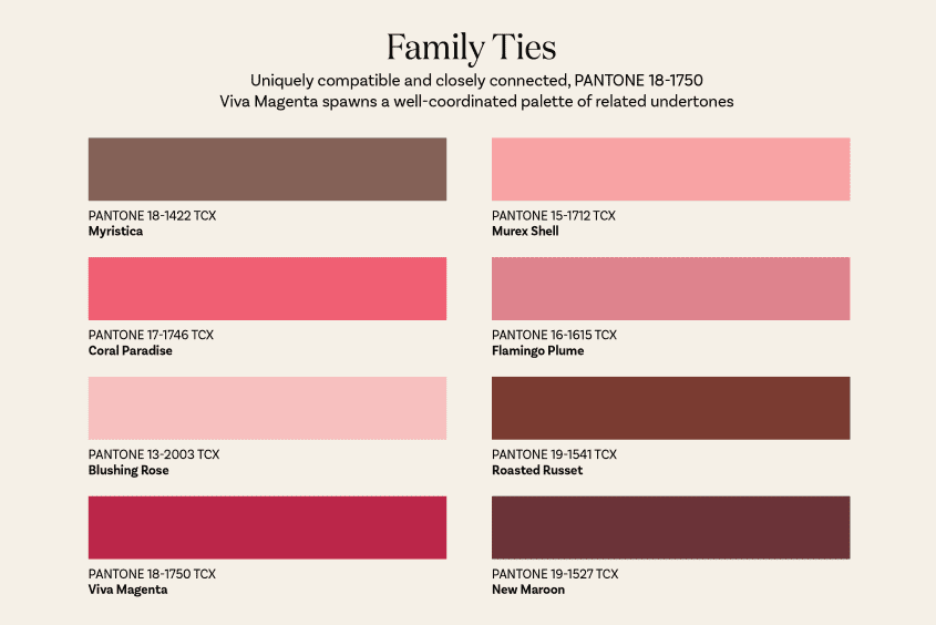
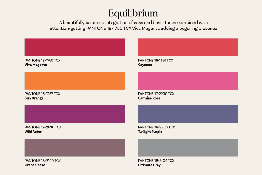
Apartment Therapy (one of our favorite places to look for trends) put together four different palettes that they feel Viva Magenta would work well with. The first, called Resonance, is a sumptuous selection of colors that give a very rich and elegant feel to a room. Looking at them, they make us think of soft velvets, a warm fire, and a glass of wine. The second, titled Ignite, is all soft hues that Viva Magenta splashes into the middle of. If you're usually one for calmer, more relaxed environs, this might be the palette for you. The third palette is one aptly named, Family Ties. This is a palette built around the shades both brighter and darker than Viva Magenta, pinks, reds, maroons, and a soft red-grey color that we didn't think we could like and have been surprised. This one brings to mind the dining room and kitchen, with warm tones that evoke friendship, family, and community. The final palette is one titled Equilibrium, and while the other palettes have had Viva Magenta as the star, this one balances the color with others of equal vibrancy. This one is all about rich hues in very tropical tones with two softer colors to keep it from exploding into a riot.  

(Credit: Apartment Therapy)


All four of these palettes are only the beginning of what we expect to see over the next year, or more, as people play and experiment with this color. If you've already got ideas, why not show it off on our Facebook? 


Places It Might Look Good Around The Home

We think that Viva Magenta can be great just about anywhere, depending on how you balance it. If you've got a room that needs a bit more pop to it, throw in a few blankets and pieces of decor. If you're looking for something louder, try painting a wall or painting the trim in it. We could also see this as a way to paint your ceiling if you're not wanting to change up the walls but still want to add some heat to a room. There are SO many different ways that this beautiful red could fit into the home that we aren't really seeing a place where it wouldn't fit. 


An interesting side note for those of you who enjoy speculation on colors. Originally many suspected that the color Digital Lavender was going to be this year's color.  While many experts, including MSN & Architecture Digest both, reported early on this was the color, it ended up not being the case. We will say that the calmer grey-hued lavender is a very nice color, but we find that Viva Magenta is very fitting for this year and the hopes that many are bringing into the year.  


What about you? What are your thoughts on Pantone's color of the year? Will you be bringing it into your decorating? Your furniture?What about your appliances? Let us know in the comments below or over on our Facebook page. 


If, on the other hand, you're more worried about the health of your appliances rather than what color they are, we can still help with that. Reach out to us on our contact page or by giving us a call at ((214) 599-0055). We'll work with you to find a time and date that work for your schedule and send one of our experts out on the day you choose. At Appliance Rescue Service, our goal is to get your home running smoothly again. 


Top Tips to Achieve Scandinavian Design In Your Home

 How To Make Your Home Look Like A Hygge Getaway

With winter coming in fast, many people are looking at the neat designs of places that have winters far more brutal than here in Texas. With that sort of idea in mind, we would like to bring your attention to the warmer and more cozy cousin of modern minimalism: Scandinavian design! Whether you’ve never heard of it, or you’re looking for tips to get started, this is the article for you. 

What is Scandinavian Design


Many people's first question is what is Scandinavian design and “where does it come from?” 

Scandinavia is made up of three European countries located far to the north: Norway, Denmark and Sweden. 


Scandinavian design comes from the fact that houses are usually on the smaller side, and people are stuck in their houses for long periods of time in winter. From these two facts it makes sense that the style consists of clean lines, and a lack of clutter  Functionality without sacrificing beauty is a key concept, because you're going to be staring at it quite a bit and there just isn't room for things if they don't serve a purpose. Scandinavian style also favors bright, airy spaces and a focus on nature, unlike it's stylistic cousin, minimalism, which is drawn more by darker colors and the division of spaces. A final important factor is texture. If something is soft, warm and fuzzy? It's probably a good fit for Scandinavian design. Think of things like faux fur carpets, thick plush blankets, and soft pillows. All things to keep you warm and cuddle up in after a long cold day. 

A Scandinavian living room, painted white, with shades of warm wood and multiple plants, and covered in multiple different textures is the epitome of Scandinavian design

Courtesy of Teryn Elliott

.

How To Achieve Scandinavian Design In Your Home 


Play with Natural Light

Because light is so limited that far north during the winter, it's especially important to find ways to make the most of it. So, play up the windows, bring in lamps that imitate natural light and make the most of the light you do have. It also means keeping your surroundings bright and possibly playing with mirrors to maximize light as it comes in. 

a white room holds multiple examples of reflected light and sunlight bulbs as well as mirrors, making the most of Scandinavia's limited winter light

courtesy of Decorilla


Use Warm Wood

Warm woods like oak, and spruce, pine and birch  are great for this design style. All of them are light colored woods that add to the feel of both merging with nature and also keeping your space light and airy. 

a dining table is central to the photo, stained a light color and the floor mimics it, balancing the white of the walls

courtesy of Decorilla


Light, Muted Colors Overall with Small Pops 


We keep talking about how long and dark the winters are and we're not done. In order to keep your home bright during the winter, Scandinavian style would have you paint your walls white and use mostly muted or soft colors to keep everything feeling cohesive. You can however make choices of natural brighter colors and incorporate those throughout, so long as they’re in small doses. 


Clean Lines

When it comes to furniture, light fixtures etc, go for things that are clean and natural lines. Overly complicated designs are not something that meshes with Scandinavian design . 


Think Cozy

As we mentioned up top, winter is long and miserable in Scandinavia. Even if winters are mild here in Texas, you can fudge this one a little and still get the look. Get accent carpets of faux fur. Get pillows and blankets that are wonderful to curl up with even on stormy days. Think of what cozy means to you and bring that in. 


Mix Textures

Building on the last one, use multiple textures in your decor. Bring in soft and silky, chunky knits and plush throws. Layering textures like this helps to add to the cozy atmosphere you're building.

A nursery in shades of white and grey has a multitude of soft textures and pillows layered throughout the room.

Courtesy of Decorilla

Clutter Free Spaces

Although newer houses are being built larger, houses were typically built on the smaller side as it was easier to heat during the winter. A side effect of that meant that they didn't allow for excessive amounts of stuff. So you won't see much in the way of clutter in most Scandinavian homes. 


Greenery

To help bring life into the home, quite literally, plants are found in many Scandinavian homes, even in the depths of winter. 

Several different plants are grouped together on and around a side table


And that’s a wrap! What do you think? Are you interested in bringing Scandinavian design into your home? Let us know your thoughts in the comments below or over on our Facebook page. 


And as usual, if you didn’t wind up here because you’re looking for decor ideas, but because your appliances are malfunctioning, let us know! At Appliance Rescue Service, our goal is getting your home running smoothly again, whether it’s your dryer or your oven that’s malfunctioning or your ice maker has decided to just stop working. You can reach out to us on our contact page or by giving us a call at ((214) 599-0055). Wherever you are in the Dallas Metro Area, we’re here for you.