
Red & blue, bright and soothing, a color of contradictions.
Welcome to 2022 everyone! We’re taking a look at Pantone’s Color of the Year and how you can bring it into your home.
This year’s color is a first for Pantone in their 28-year run. Instead of going with already existing colors, they created a new one. The color of the year for 2022 is Very Peri “Very Peri is a new red-violet infused blue hue.” Pantone said that they created the color because “Creating a new color for the first time in the history of our Pantone Color of the Year educational color program reflects the global innovation and transformation taking place. As society continues to recognize color as a critical form of communication, and a way to express and affect ideas and emotions and engage and connect, the complexity of this new red-violet-infused blue hue highlights the expansive possibilities that lay before us”.” We think it’s going a bit much for the color terms, but it’s a beautiful color. A beautiful mix between red and blue, and it’s surprisingly soothing, while also making us feel rather playful? It’s a confusing color, but pleasing. We can see it being used almost anywhere, primarily in terms of fabrics and accent walls. We could even see it in a child’s playroom or nursery.

Pantone
What about the colors that Very Peri pairs with though? No color exists by itself, so what does VP pair with? Fortunately, Pantone has given us several very different palettes.
The first one, Balancing act, is a very aptly named palette. It’s a balanced palette with both cool tones and warm tones, making each one pop in different ways. There are four neutral roses in the palette that we can see being used for carpets and furniture, with the two greens, very peri and the clay color, being used for different pops of color in a room. Alternatively, we could see the walls being painted in the different roses, with very peri being used for an accent wall.
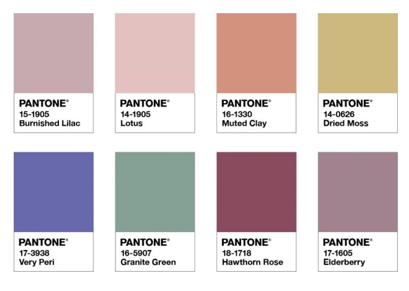
Pantone
Our next palette is called Wellspring. This one is full of lush greens, blues, and purples, with the wild card “dirty chai’ thrown into the mix. This one we see not so much for a living room, but for a personal office, although we would say to stick to neutrals for your flooring. Unless you want to do one of these strong colors? Then we say go for it, but we’ll leave it to you. We love this rich mix of colors, very reminiscent of a day in the garden, which is why we could see it working in a personal office. Use the different colors and their vibrancy to encourage you to reach your max every day.
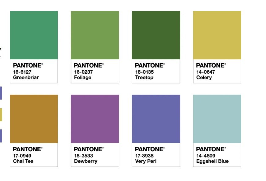
Pantone
Our third palette is Star of the Show, and that is exactly what very peri is in this palette. This time we’re looking at a mix of different true neutrals, creams, browns, greys, and black. This palette would work almost anywhere. You would end up using the neutrals of the palette over everything, from the wall, to the floor, to the furniture. Then you bring back in very peri to make everything pop. That color could be used anywhere you wanted to bring interest. A doorway, behind a picture gallery, highlighting the prime focus of the room, whatever.
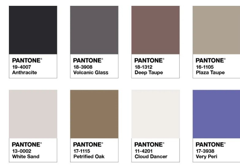
Pantone
Our final palette, at least directly from Pantone, is called Amusements. This one is full of bright, eye-popping colors that we think (hope?) is really going to be left to the clothing industry. These colors are so bright that we can see how people are going to love them, but we also are uncertain how many companies will put out items in these colors. (Although we will include a link to our article involving vinyl wraps for your appliances down below.)

Pantone
So that’s the color of the year for 2022! What do you think? Where do you plan to use it in your homes? Do you like the color at all? We’re still trying to figure it out for ourselves, but we want to hear from you. Let us know your thoughts on the color and its coordinating color palettes over on our Facebook page. As usual, we’d love to hear from you!
If on the other hand you got lost on our page because you were looking for help with your appliances, you are actually in the right space. We can help you whether you’re looking for someone to fix your washing machine or your dishwasher, your stove, or your refrigerator, we can help. You can set up an appointment on our webpage or by giving us a call at ((214) 599-0055).